
OVERVIEW
Around March 2020, with COVID quarantine in full swing, I felt it was time for me to practice some of my UX skills through an independent project.
Realizing that I would be jumping back into the world of roommates after my year-long sabbatical at home, I was overcome with anxiety. Having had previous difficulties cultivating friendships in a roommate setting, I was worried that the added COVID stress would make the transition nearly impossible.
After researching the world of apps for an aid to remedy this anxiety, I quickly found that the pickings were slim when it came to holistic housemate organization. So, I went to work.
ROLE & DURATION
Competitive Analysis
Wireframing
Visual Design
Interaction Design
March '19 - April '19
THE PROBLEM
How might we facilitate a communicative and transparent living environment for young roommates?
Competitive Analysis
My research began with an in-depth look at the current market for house-mate organization and living application.
Ultimately, my goal with doing this competitive analysis was to understand what features were being used by my competitors - what worked and didn’t work - and if I felt I could bring anything new to the table.
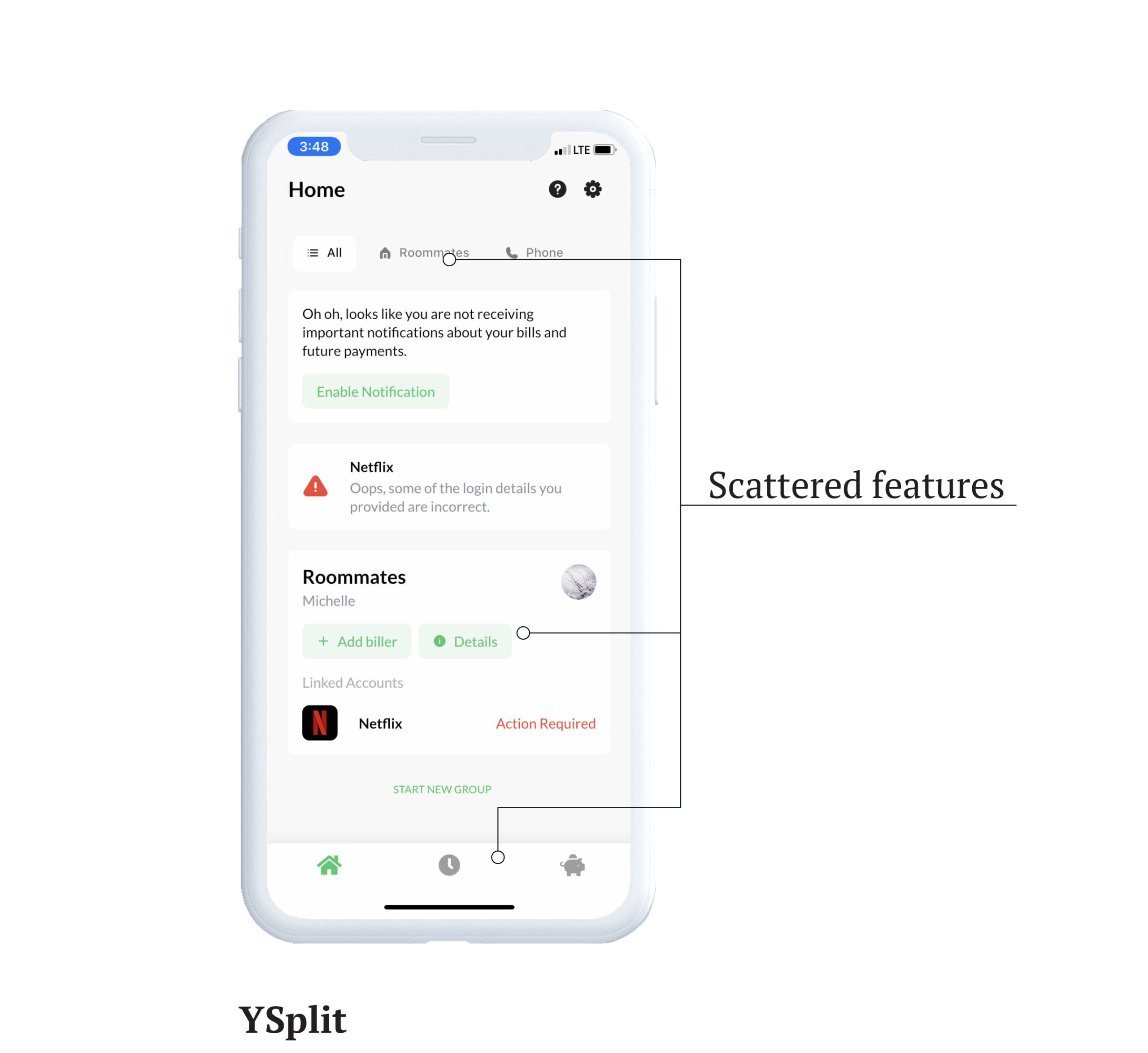
YSplit | Indirect Competition
The main page had its features mostly scattered, instead of having some sort of central toolbar. This made it more difficult to navigate than it could’ve been.
Offers a lot of unique features when it comes to bill pay, like editing bill split percentages and connecting accounts directly to the biller.
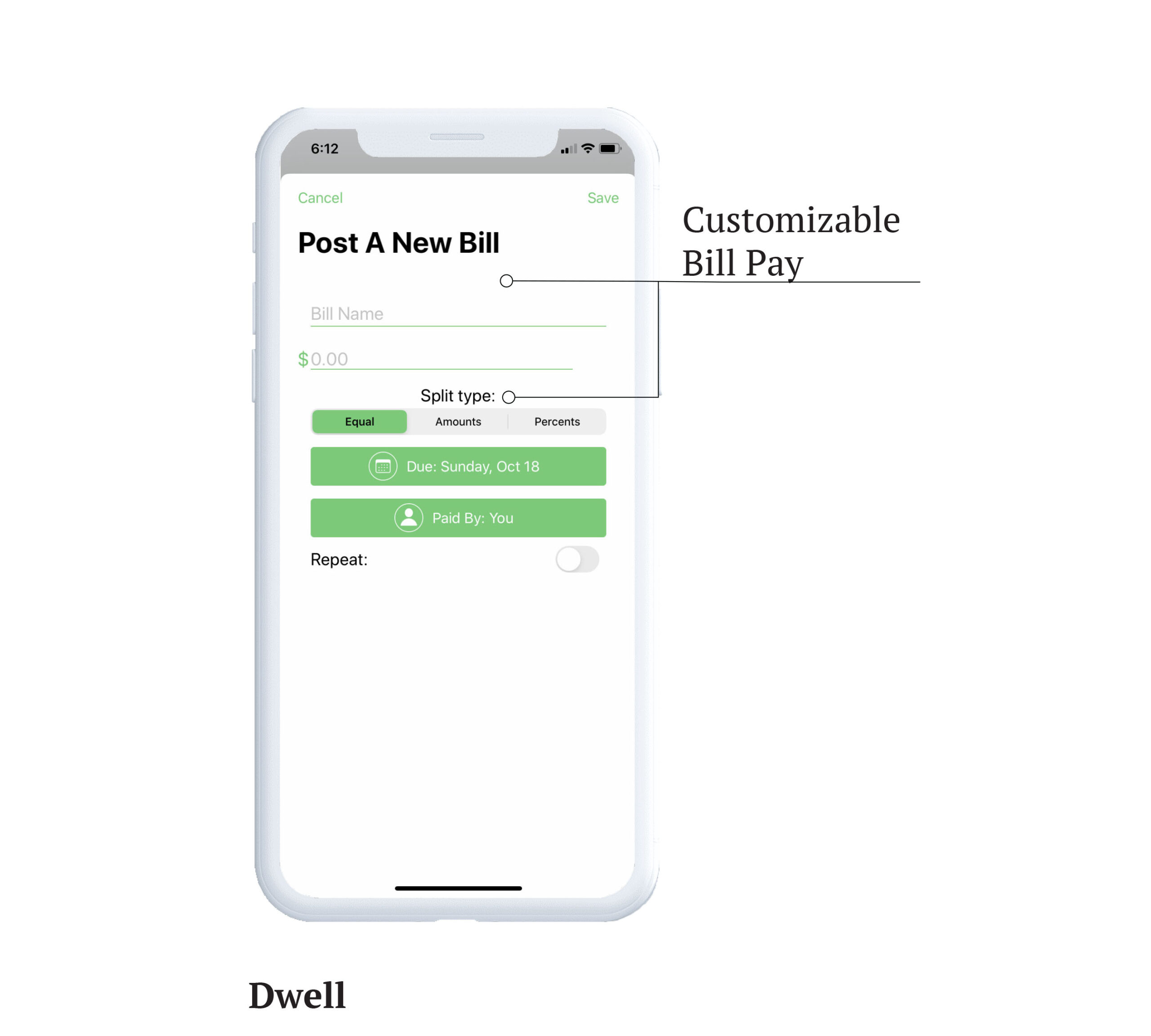
Dwell | Indirect Competition
Does well in managing bill pay and chores - the bill pay is manually entered so there is no need to fuss with biller accounts. This also allows the opportunity for grocery bill pay instead of other household bills like rent, water, and electricity.
Dwell also offers a history of past chores and bills for record-keeping. Although, no outlet for other features like groceries and scheduling.
RoomMate & Flatastic | Direct Competition
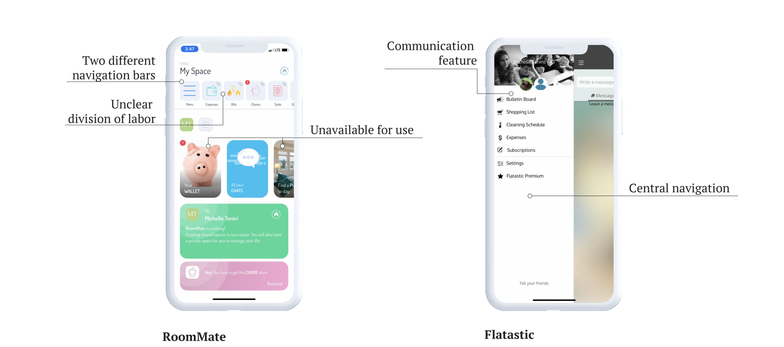
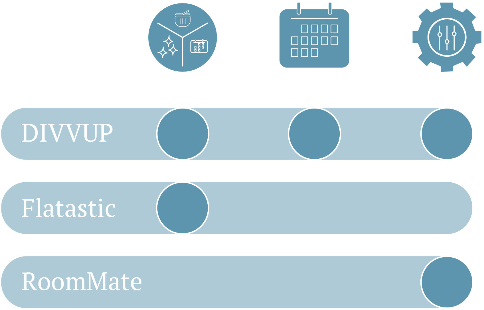
RoomMate and Flatastic were just two of the many apps guarding the shared space organization market. Unsurprisingly, most had similar features such as chores schedules and shopping lists. However, it is what each individual app decided to add on top of those common features that determined its value.
After spending a few days familiarizing myself, I found that RoomMate’s strength lies in its customization feature, while Flatastic does well in incorporating a communication feature. Below are some more takeaways from the direct competitor analysis.
Design Requirements

Division of Labor
Features seem to overlap - for example, RoomMate’s chores and tasks, as well as bills and expenses, feel like they should be combined.

Customization
There is a lot of customization involved, which is good. Being able to tailor the app to fit the user’s needs and get rid of some of the clutter from unused features is a smart move.

Schedule Management
A house life organization app for roommates, but there is no page that coordinates schedules (Flatastic’s messages feature comes the closest). Schedule keeping is key in facilitating healthy communication.
Synthesizing the Information
The group I was designing for revolved around young, first-time renters who are navigating the ins and outs of living with non-family members. The design had to facilitate a transparent living situation that is centered on communication.
Keeping the user in mind, along with the information presented in the competitive analysis, I made some informed decisions regarding what features I would offer as part of my design solution.
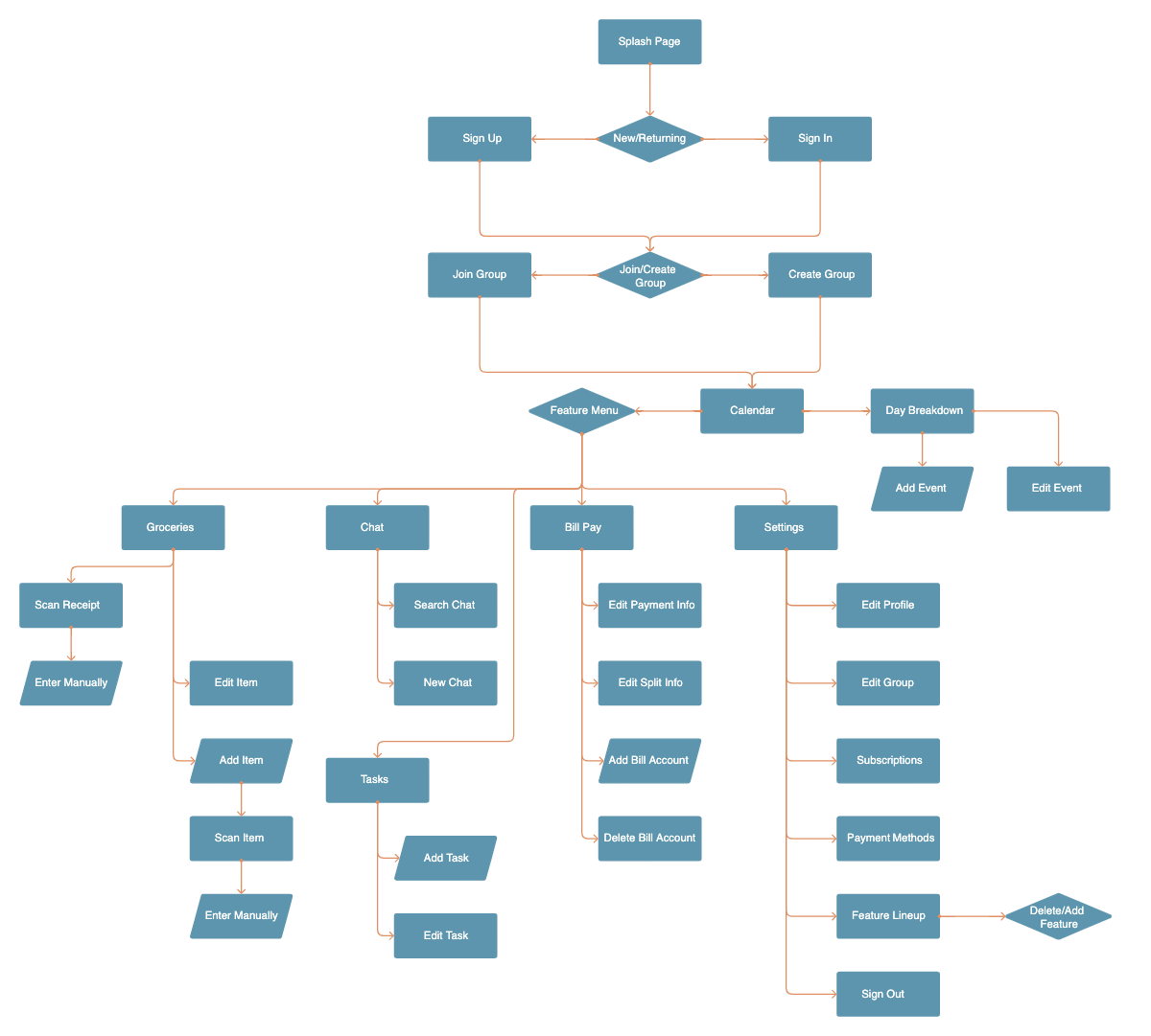
01 | Calendar
This feature will be the center of the application, offering a chance for the users to coordinate schedules and stay informed.
02 | Chat
The chat feature is available for large households, those who want to keep house-related matters in one place, or simply for convenience.
03 | Groceries
It is not uncommon for roommates to spot each other when it comes to grocery runs. This feature will enable whoever is making the week’s grocery trip to avoid the hassle of multiple lists and requests. A scan receipt feature will also be embedded in order to easily split back up the purchases.
04 | Bill Pay
Bill pay is a common feature across multiple platforms. This will allow roommates to split house expenses efficiently.
05 | Tasks
As is expected with any roommate organization app - this will provide structure and responsibility to daily chores and household maintenance.
Mapping Out The Flow
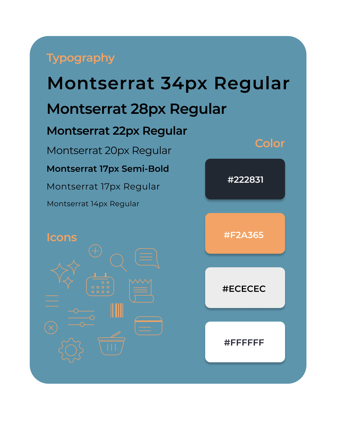
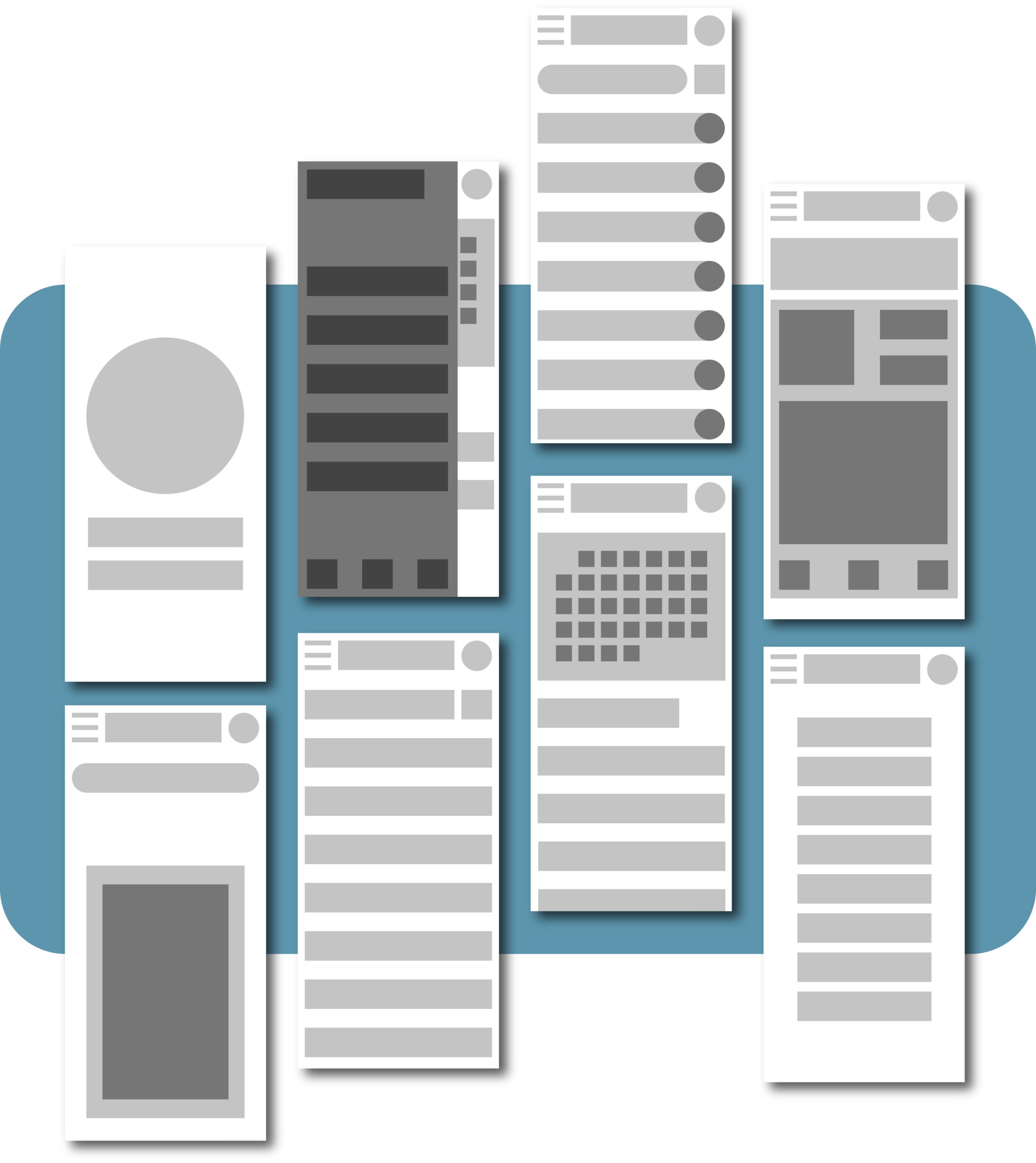
Style Guide & Wireframes
Making a Decision
When I first created the style sheet and subsequently began working on my high fidelity prototype, I had envisioned the app having a dark theme with bright colors to pop out. I was adamant about the color orange and felt it would pop better on a dark screen rather than a light screen.
After creating a couple of screens, I took a step back to evaluate exactly who I was designing for and whether or not these screens fit the vibe.
I came to the realization that although the dark color scheme was pleasing and on-trend, I was designing a housemate organization app that was supposed to emulate lightness and cleanliness. I then made the decision to switch to a light color scheme, understanding that there could potentially be a slight tradeoff in readability.
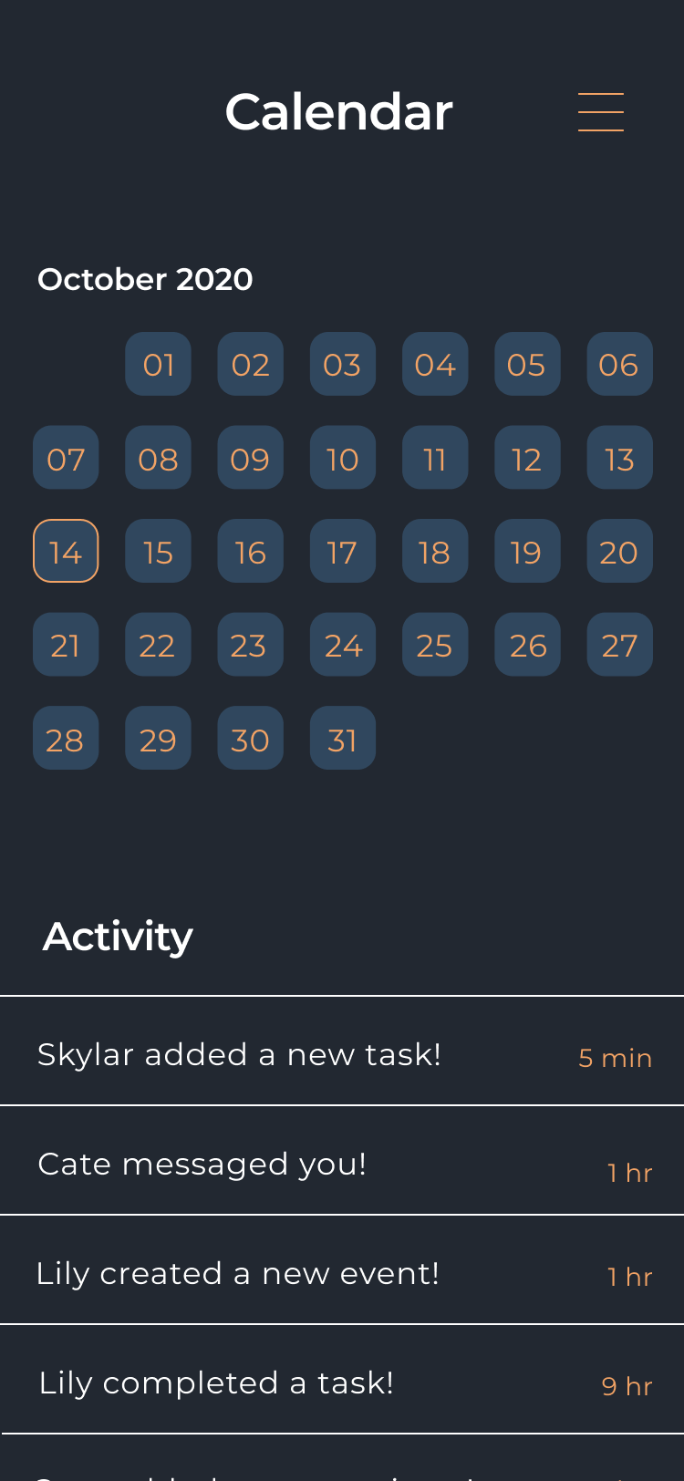
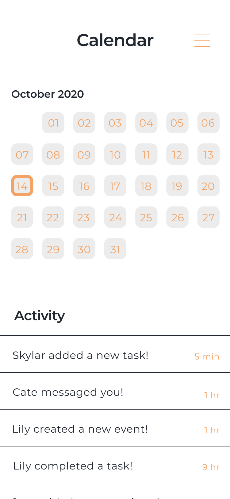
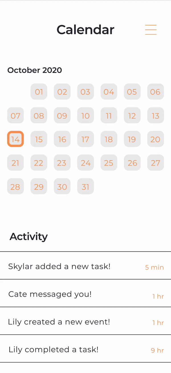
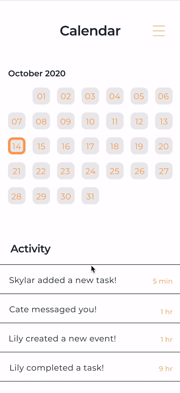
Calendar
I opted to include a calendar visual along with an activity log to facilitate housemate communication and transparency.
On the daily happenings side of things, users have the option of customizing their events based on title, time, participants, and description, allowing for maximum customizability.
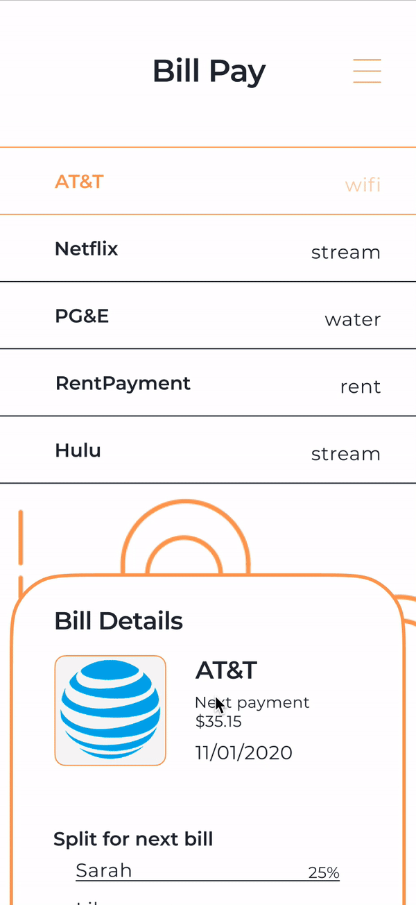
Bill Pay
Bill pay coordination is arguably just as needed as schedule communication. Users are able to link together bill accounts and split bill payments - something I know from personal experience will help alleviate pressure on the financial front.
The similar set up as the calendar feature is a calculated decision, familiarity with content organization will help users more quickly adjust to the app layout - this is something I struggled with during my competitive analysis of direct competiton.
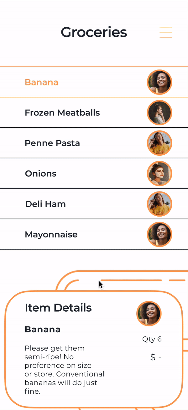
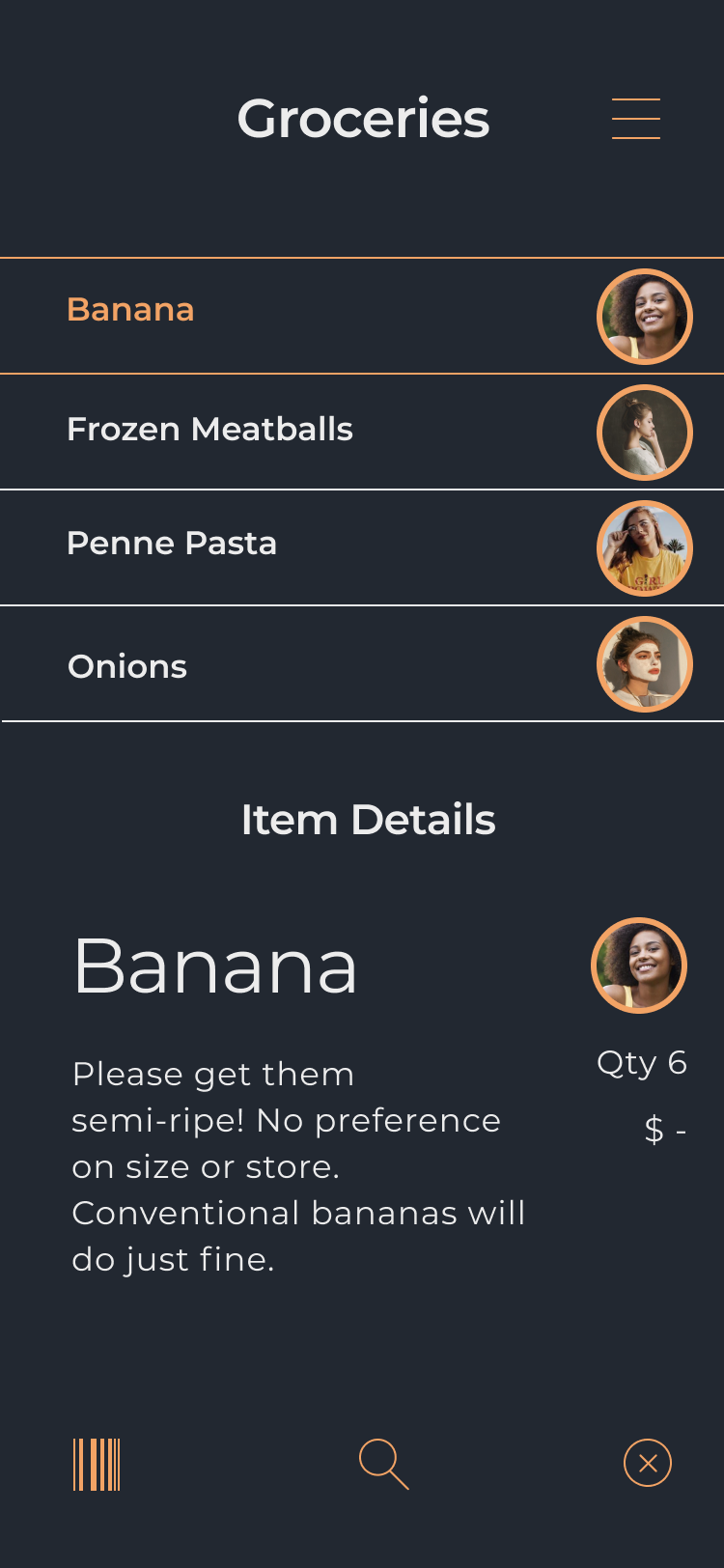
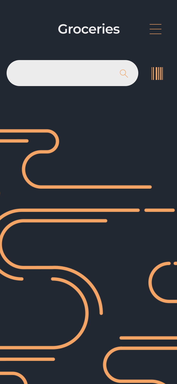
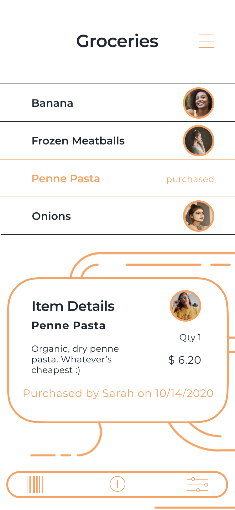
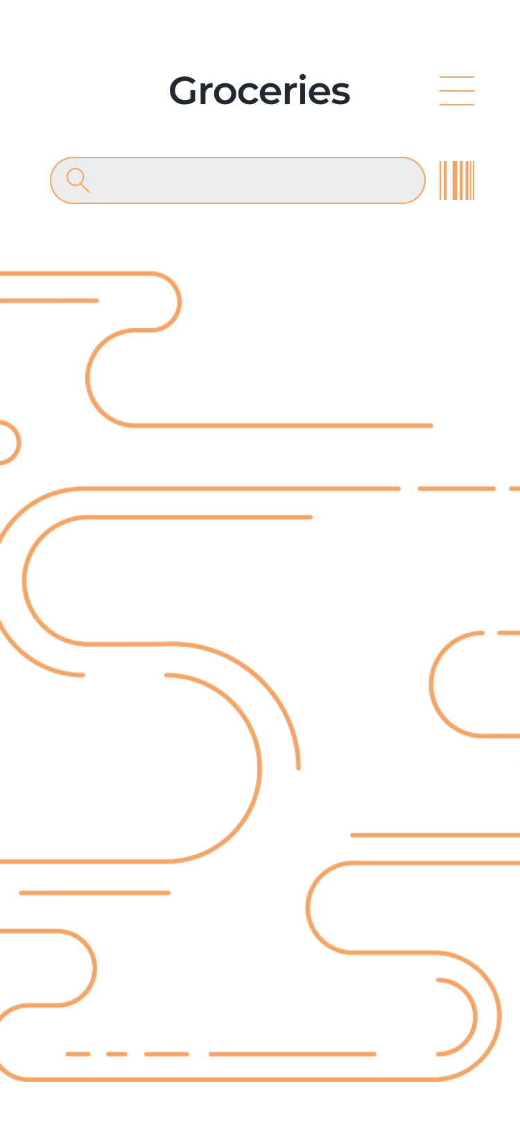
Groceries
As housemates tend to share refrigerators, and people are always going on grocery store runs, one of the top things housemates tend to do together is coordinate food purchasing. Items are organized in a grocery list feature, with options to add new items manually or scan the barcode.
One piece of functionality I was especially excited about was the ability for users to scan their grocery receipts and let the app manually fill in purchased items and pricing. This will help streamline the grocery coordination process.
Customize
Given that this is an organization application, it only makes sense to give users the ability to organize their feature lineup to fit their needs. This will help alleviate the unnecessary build-up of features and information that is often seen in content-heavy apps.
Feature Comparison
A breakdown of the points made during the competitive analysis with a look at how they compare to DIVVUP.
Takeaways
The entire design process (for what I have so far!) was about a month-long as I was working hard to materialize an idea I had earlier that year at the start of quarantine.
The best part - I had not taken a single interaction design or UX research class, so all the learning I was doing was completely online. Whether it be youtube or sample portfolios, my one big takeaway is how accessible information is, and how fun it can be to learn outside the classroom.
Next Steps
One of the main goals I hope to accomplish soon is uploading some .gif demonstrations of the prototype in action. I designed the prototype in Figma, and created an interaction flow to present my work; however, I’ve been struggling with showcasing that on my site.
I would also like to do another iteration of the design, after receiving some actual user feedback. I believe my design would benefit greatly from some critique, seeing as I have mostly been working independently on this project.
Selected Works
DIVVUPInteraction Design, Visual Design
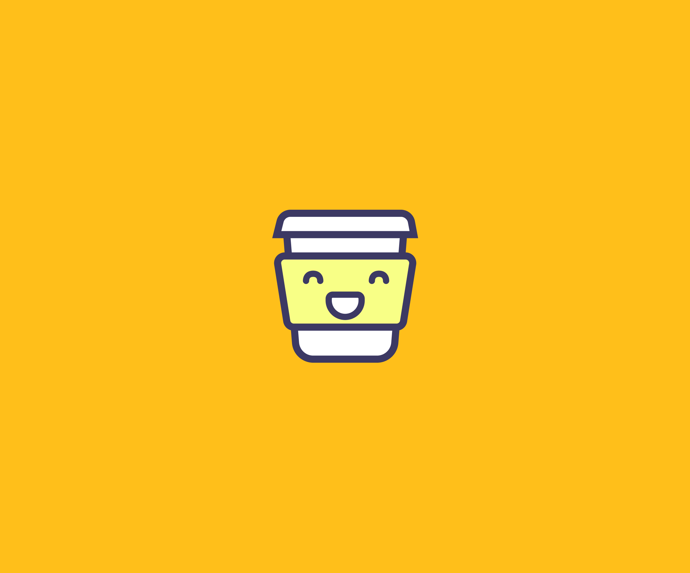
CappuccinoVisual Design, Product Research
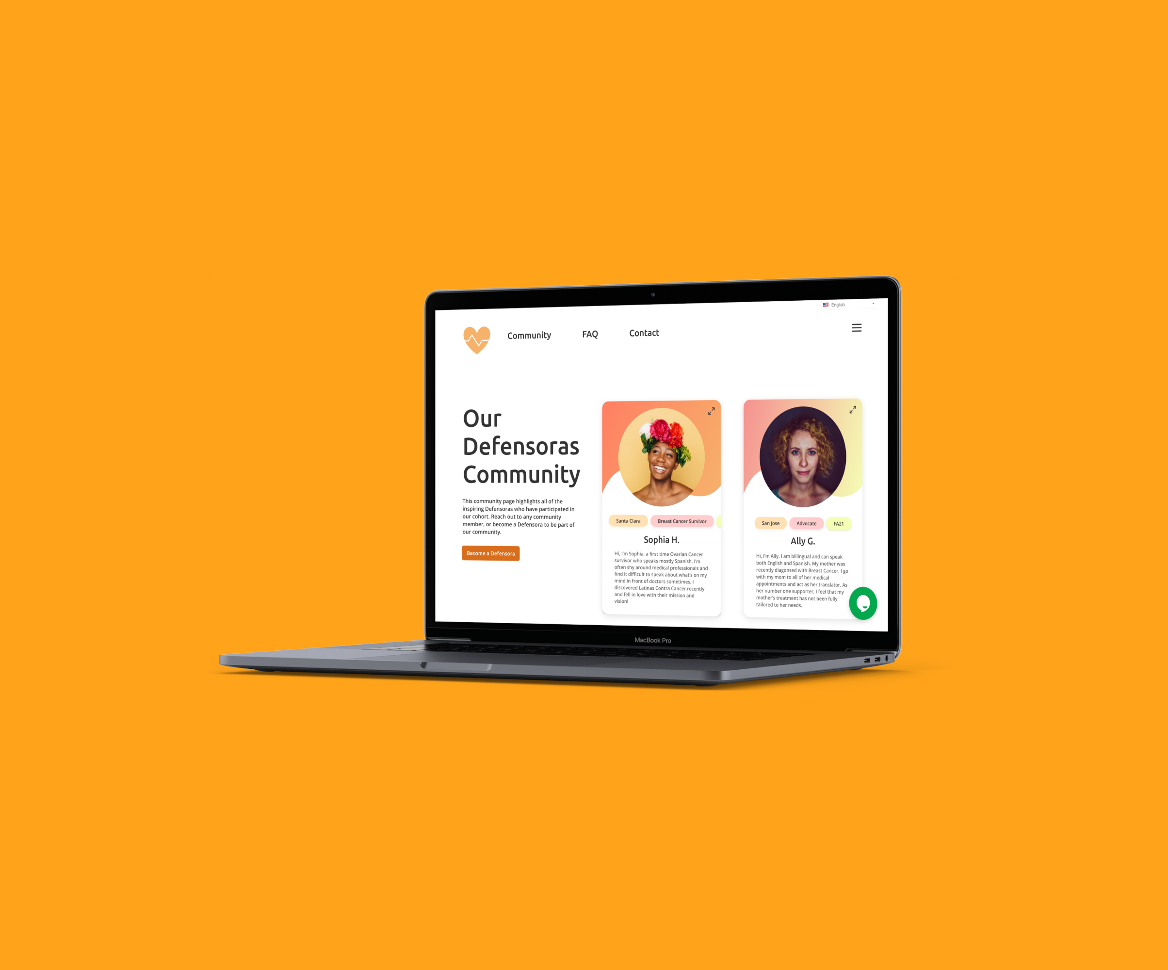
Patient AdvocacyService Design, UX Research

TecanUX Design, Information Architecture
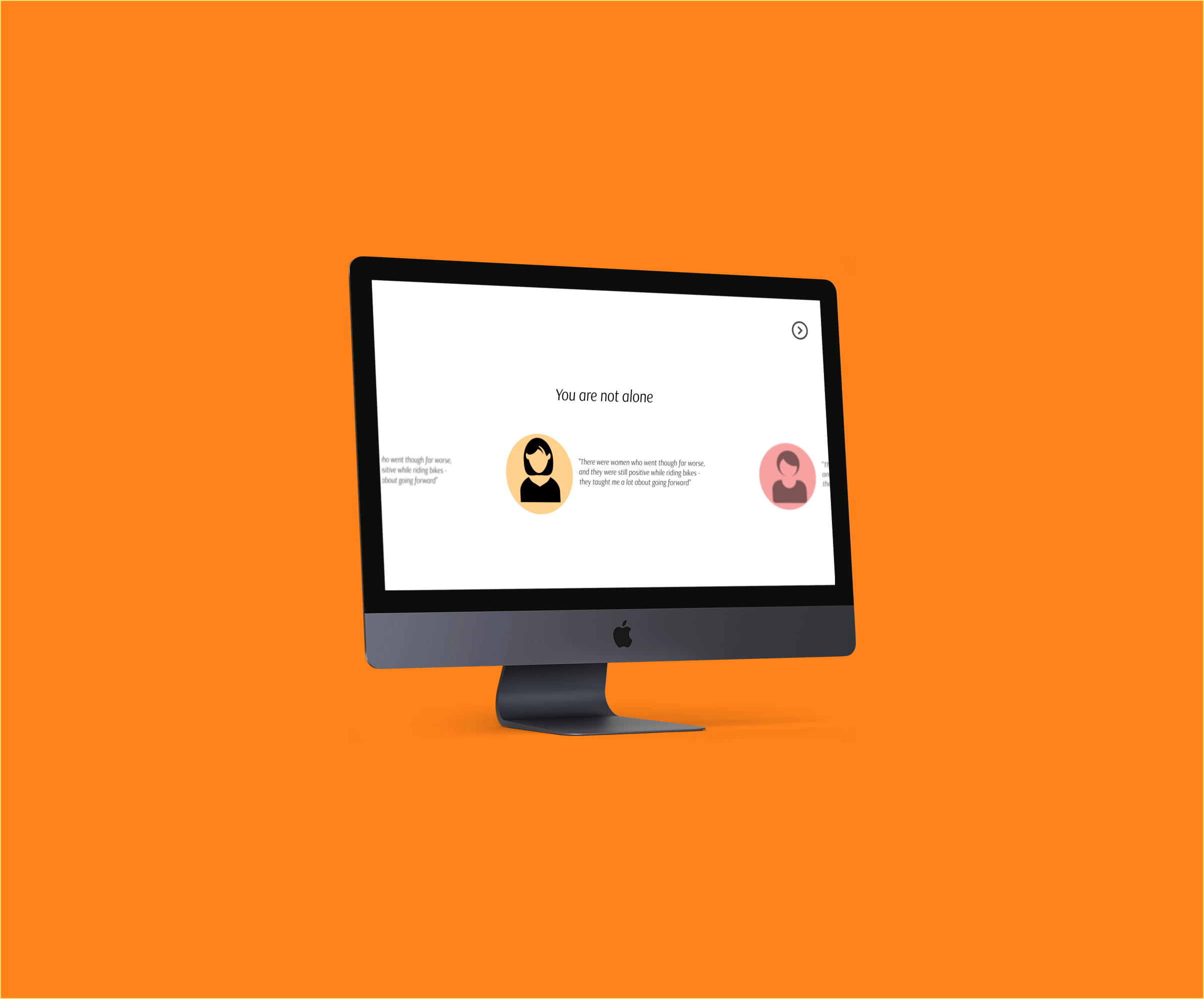
AuroraUX Research, Service Design
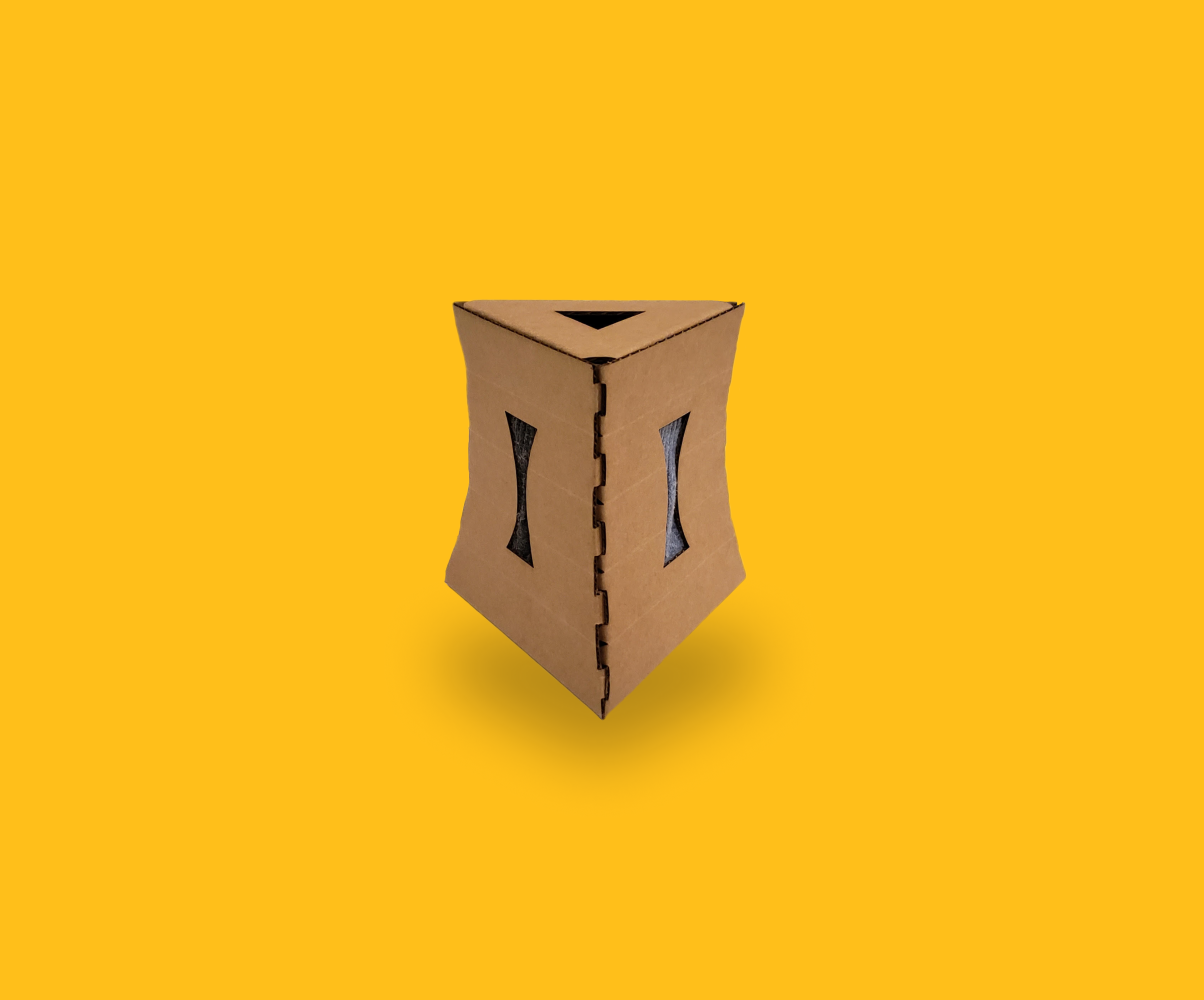
Sock BoxIndustrial Design, Packaging Design
Interested?
I am always looking for new ways to get involved in my community and gain experience in industry - let's connect!