
OVERVIEW
Recruited for the project by our lead, Sara, we began the design process by diving into the world of Ovarian Cancer treatment and survivorship.
Having prior knowledge of a potential disparity among the Ovarian Cancer survivorship network, we ventured further into the what and the why of our problem space.
ROLE & DURATION
User Research
Research Synthesis
Inclusive Design
Industrial Design
Oct '18 - May '19
CONTRIBUTORS
Sara Behbakht (lead), Kailey Terraciano, Srinithi Latha, Kerry Horton
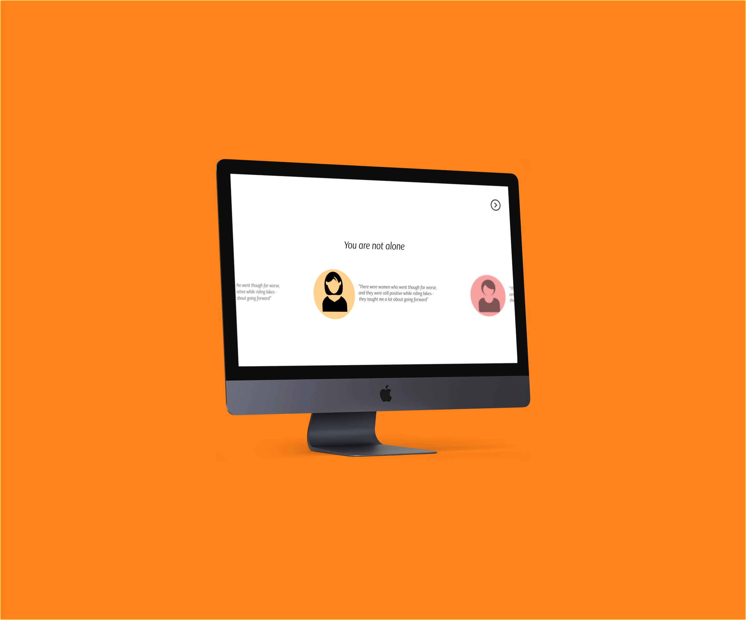
Listening to Stories
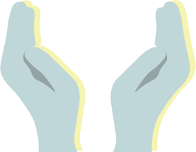
To understand and immerse ourselves in the journeys of our users, we asked a handful of both patients and professionals to tell us their stories.
“I wanted information. I wanted to know as much as I could about what I was going through.”
“I spend a lot of time with patients telling them where not to look and what not to search.”
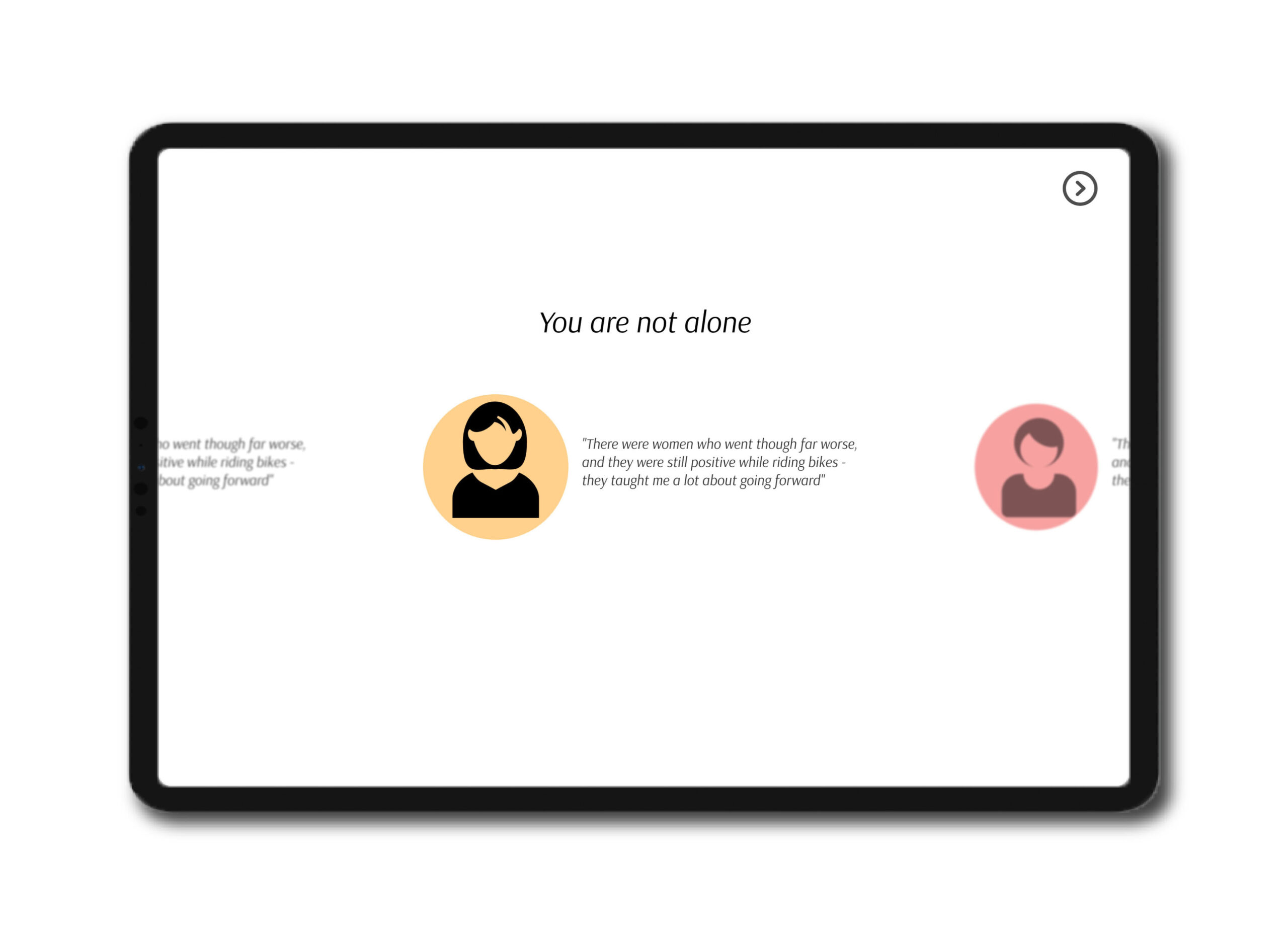
“There were women who went through far worse. They taught me a lot about going forward.”
KEY TAKEAWAYS FROM OUR OBSERVATIONS
01
There is a transition gap in patients’ post-treatment recovery.
04
Patients were grateful for the relatable connections they made during their journey.
02
Both patients and professionals felt that there was a lack of continuity in provider care.
05
Most times, patients felt they could use some sort of self-paced survivorship planning.
03
Information validity was a concern among professionals about the resources available to patients.
06
Many patients sought educational resources to help them with the next steps.
THE PROBLEM
How might we better support Ovarian Cancer survivors in their transition from treatment to survivorship?
Design Requirements
We synthesized our research by looking for patterns that would give insight into the true needs of the recovering patients. With all of our information, we boiled down our design requirements into these three categories:
Education
Survivors recognized a need for reliable and relevant resources.
Support
Survivors championed support groups that matched their interests.
Connection
Survivors valued their connections with other survivors.
Working Towards a Solution
Our team underwent a series of lightning design sessions for brainstorming our potential solutions. We knew we needed to integrate support and information without being invasive. From the interviews with the medical professionals, we understood that our problem space revolved around information security and awareness.
We finally arrived at a research and support kiosk that would be placed in the oncology area of the hospital/clinic.
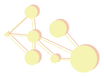
This user journey, made by Kailey Terracciano, maps out the interaction between the survivors and Aurora.
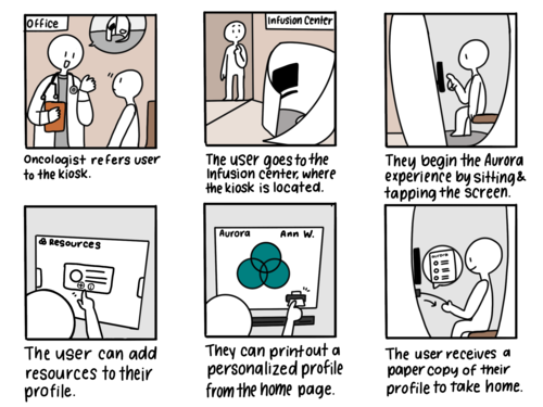
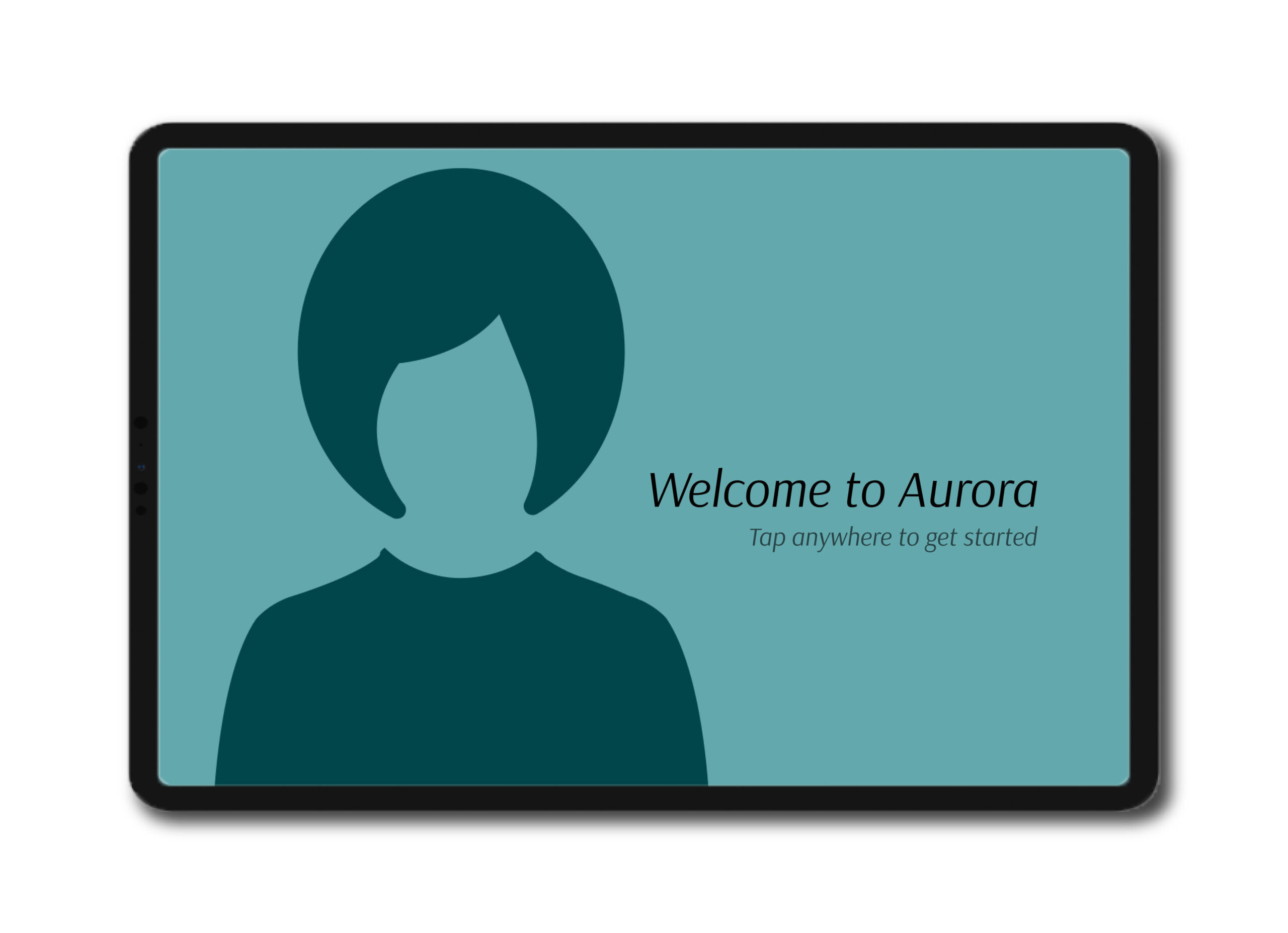
Onboarding
The goal of Aurora’s design is simplicity. The survivors we were designing form had been through such a journey already, it was imperative that Aurora emulated reassurance and ease.
Those who were interested would begin by answering a few questions that would help Aurora pinpoint which information (reading material, individual survivors, support groups) was best suited for them.
A Network of Survivors
During the onboarding process for new survivors, we aimed to showcase the breadth of women who were ready and able to share their stories and band together in the name of support.
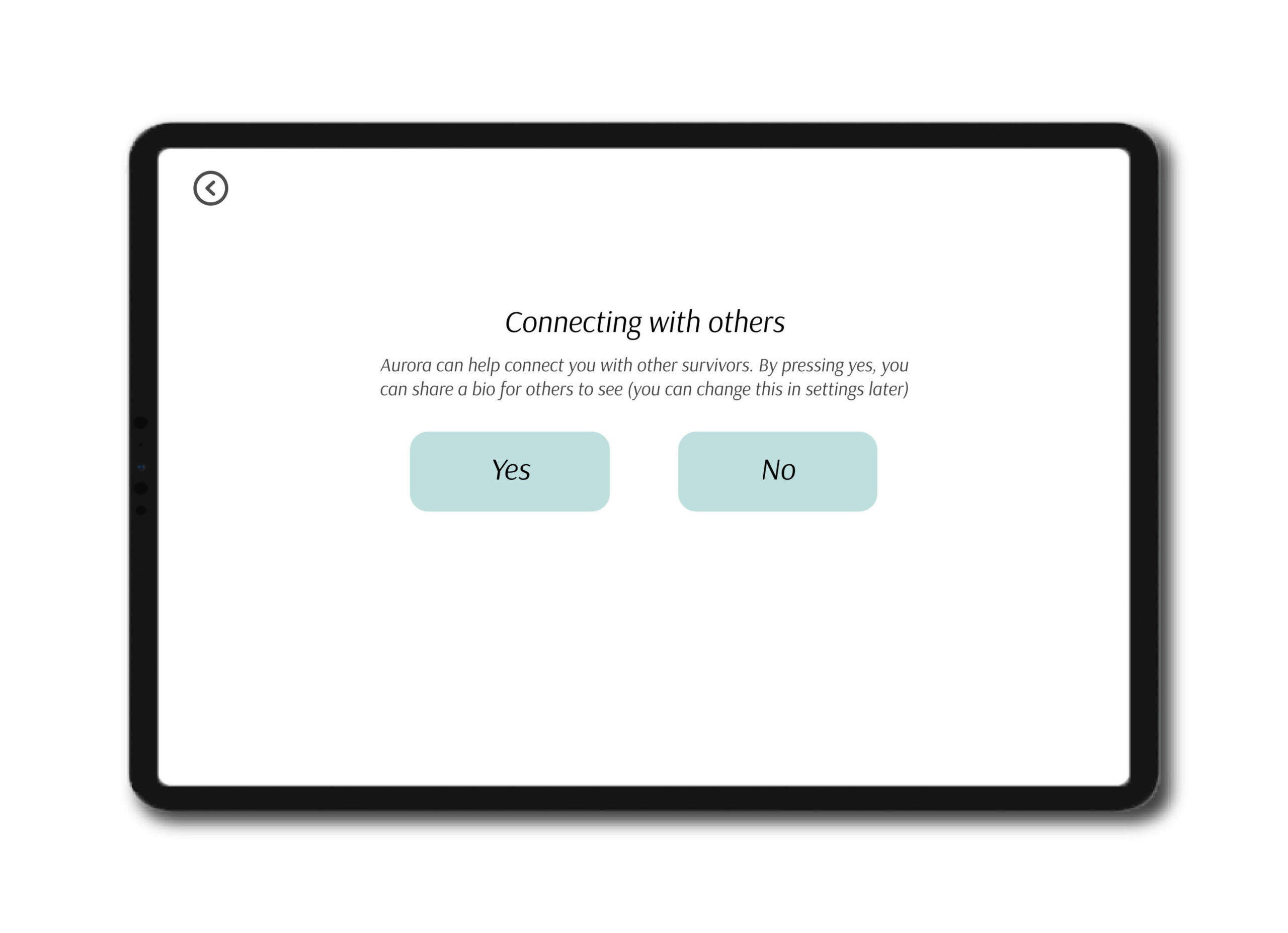
Anonymity When Needed
Not every survivor we reached out to was eager enough to jump at the opportunity to tell us their story. This is why we felt it was necessary to let the participants of Aurora decide whether or not they wanted to make their journeys available to the network. This option, yet again, featured the privacy and hands-off aspect of Aurora.
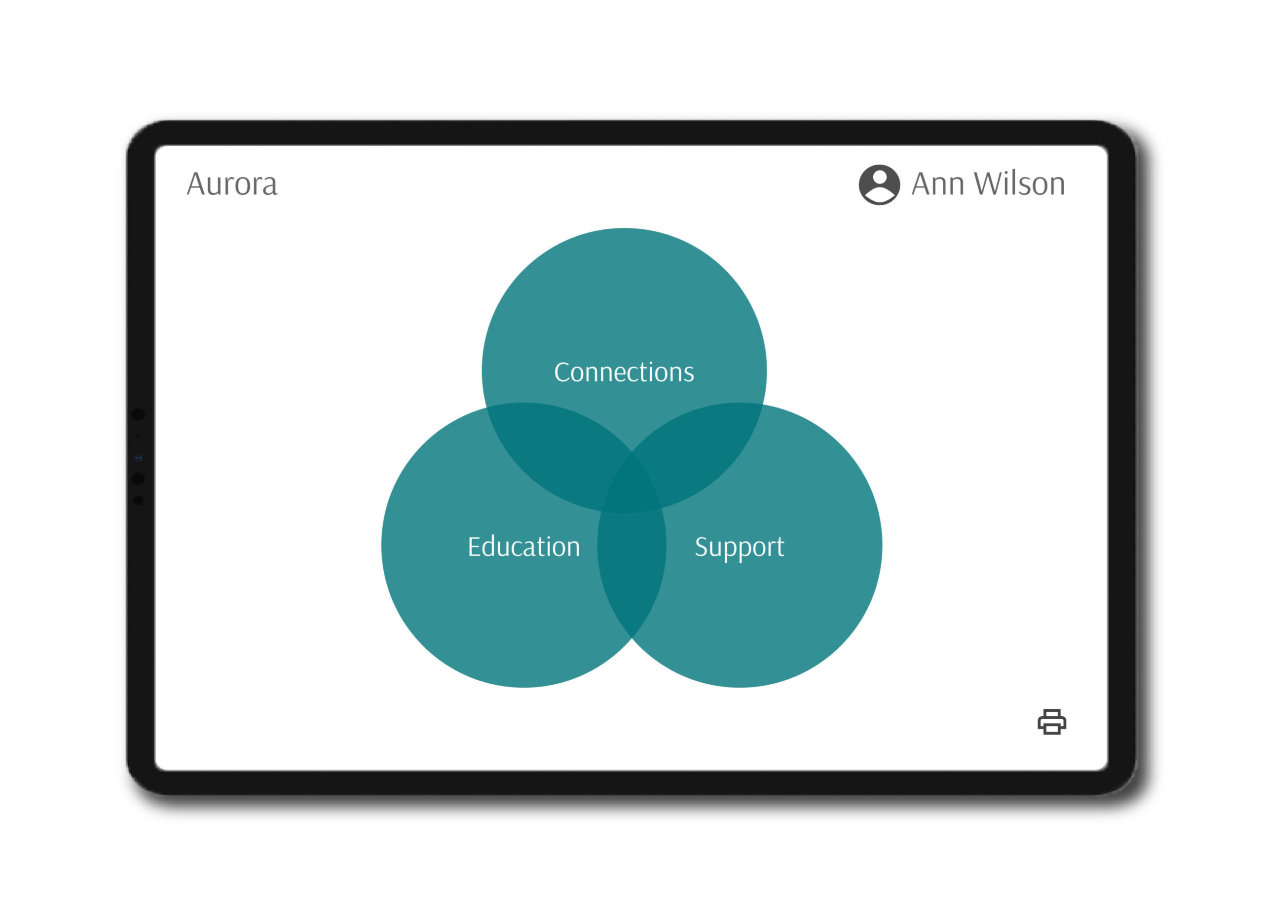
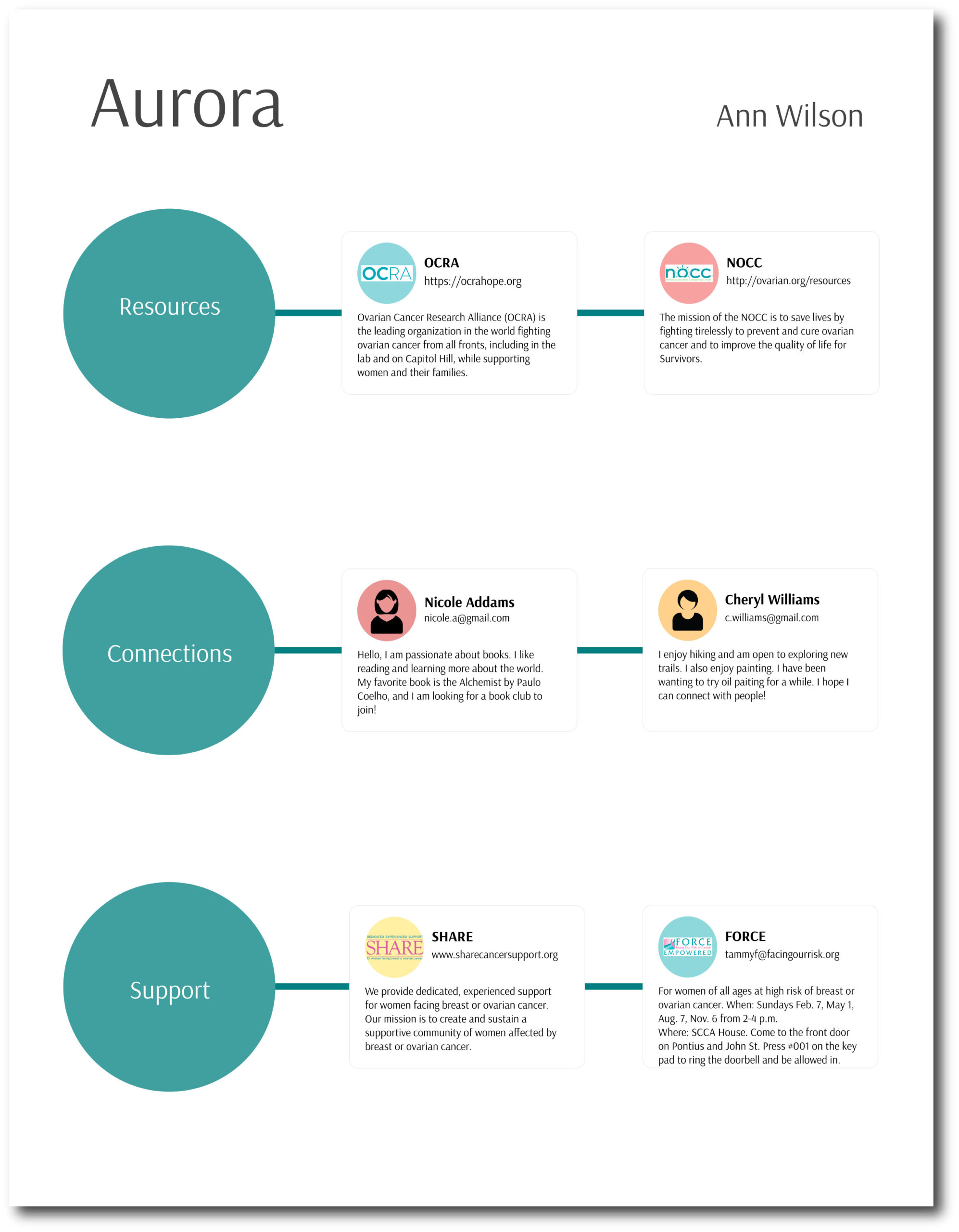
Information Station
After this onboarding process, our survivors are redirected to Aurora’s homepage where they would be able to browse through the information pulled together for them based on their responses.
Staying true to the design requirements described earlier, Aurora’s information pool is centered around these three main categories -
Connections: Names and contact info of fellow, willing, patients in the area.
Resources: Reading material and websites with professional-approved information.
Support: Names and contact info of support groups in the area.
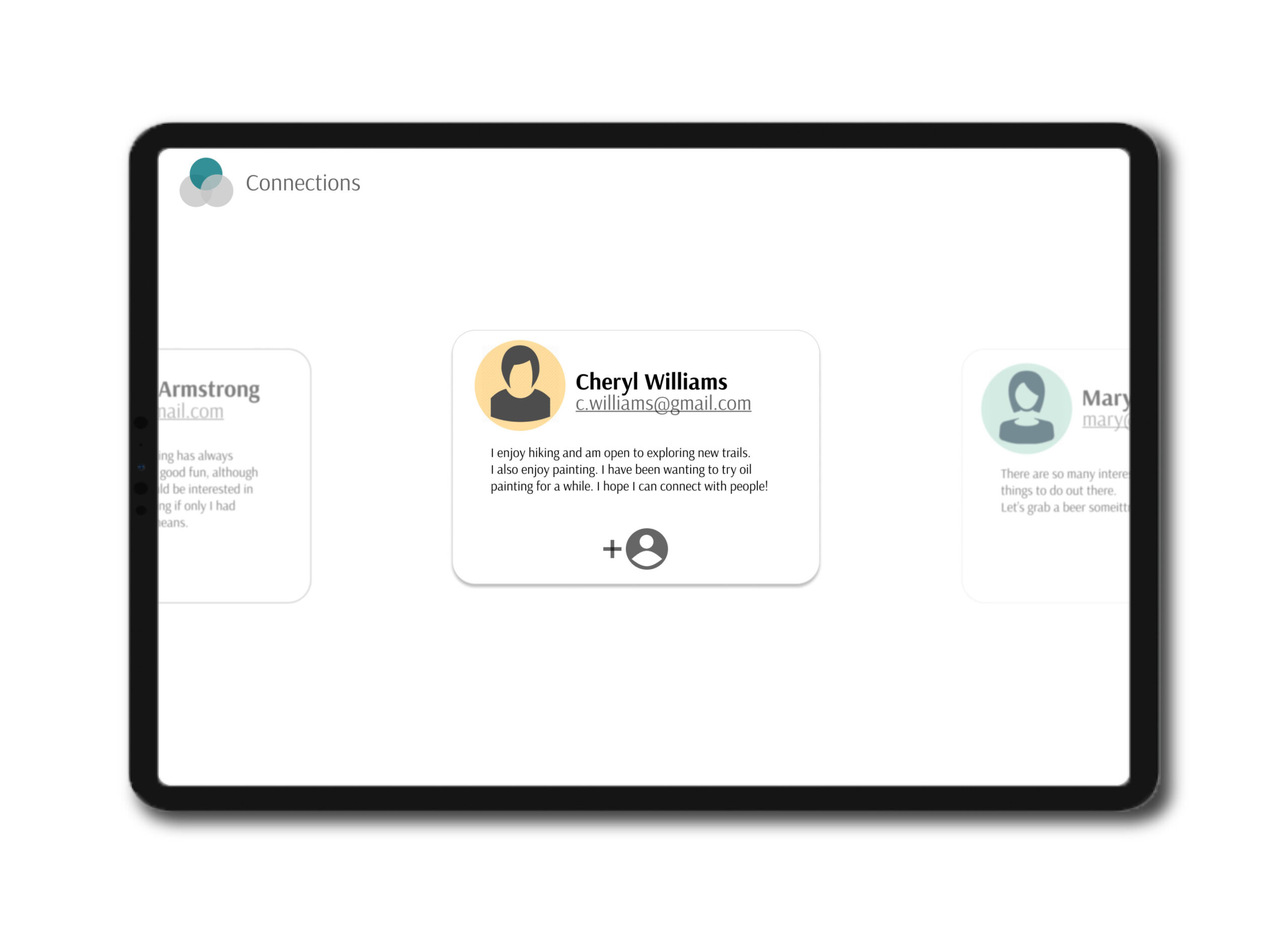
Take Your Pick
Venturing further into Aurora, the survivors are able to select each of the information bubbles and take a look at the connections, resources, and support that was gathered for them.
The survivor can take her time to scroll through her options and choose what she finds most appealing.
Take It Home
One of the main differences between Aurora and other support applications is that Aurora was designed to live on the oncology floor of the medical center. We did this because we knew the survivors already established the space as familiar and trustworthy, therefore they would be more comfortable in participating. On top of this, the kiosk would be a good replacement for the millions of support group pamphlets and information flyers scattered around the existing bulletin boards.
To remedy the need for survivors to access their information outside of the medical center, we decided it would be best to provide them with a parting gift of paper with all the resources Aurora gathered.
For the older survivors, this reference page would suffice, while those who are more technologically inclined could access the information from the web.
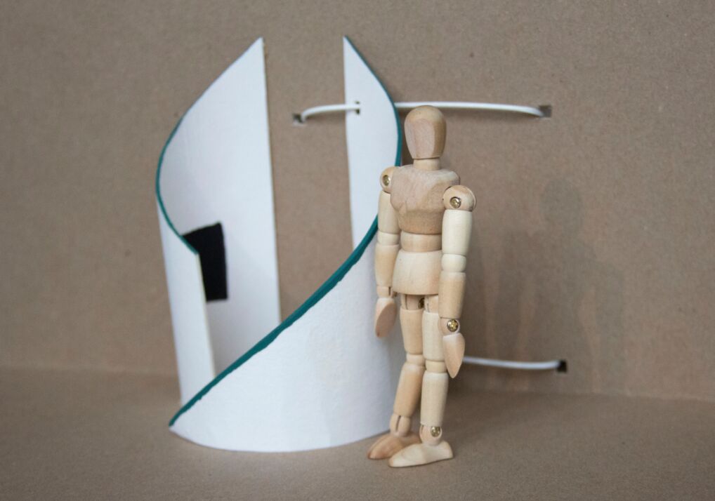
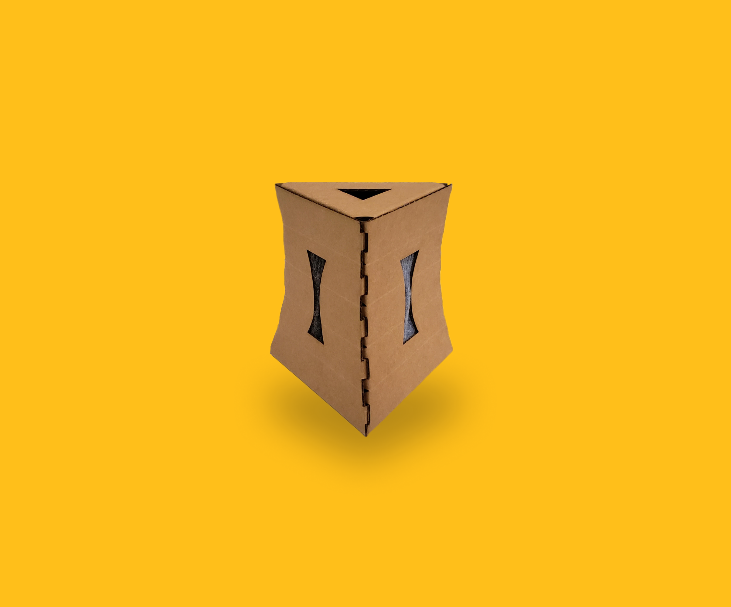
The Kiosk
There was also an industrial design aspect to Aurora, for which we went through three iterations. The kiosk was imagined to reside on the oncology floor of the UW Medical Center, so our design had to reflect the nature of the floor.
01. White interior/exterior (to blend into the hospital floor) with a touch of Ovarian Cancer teal to appeal to the user group
02. Natural, continuous lines down the kiosk to preserve the calmness of the space
03. The adjustable door allows for ADA compliancy
04. The open top to the kiosk was put in place to create space for the survivor as they seek help in their journey
05. Privacy was one of our top priorities - thus, we ensured the curves to the kiosk and the adjustable door provided enough separation from the survivor and the rest of the floor, without suffocating them (hence the open top)
Showcasing Aurora
Our project came to an end in May 2019, where the students of DFA were able to present their projects to family, peers, and faculty at Artefact, a design studio in downtown Seattle.
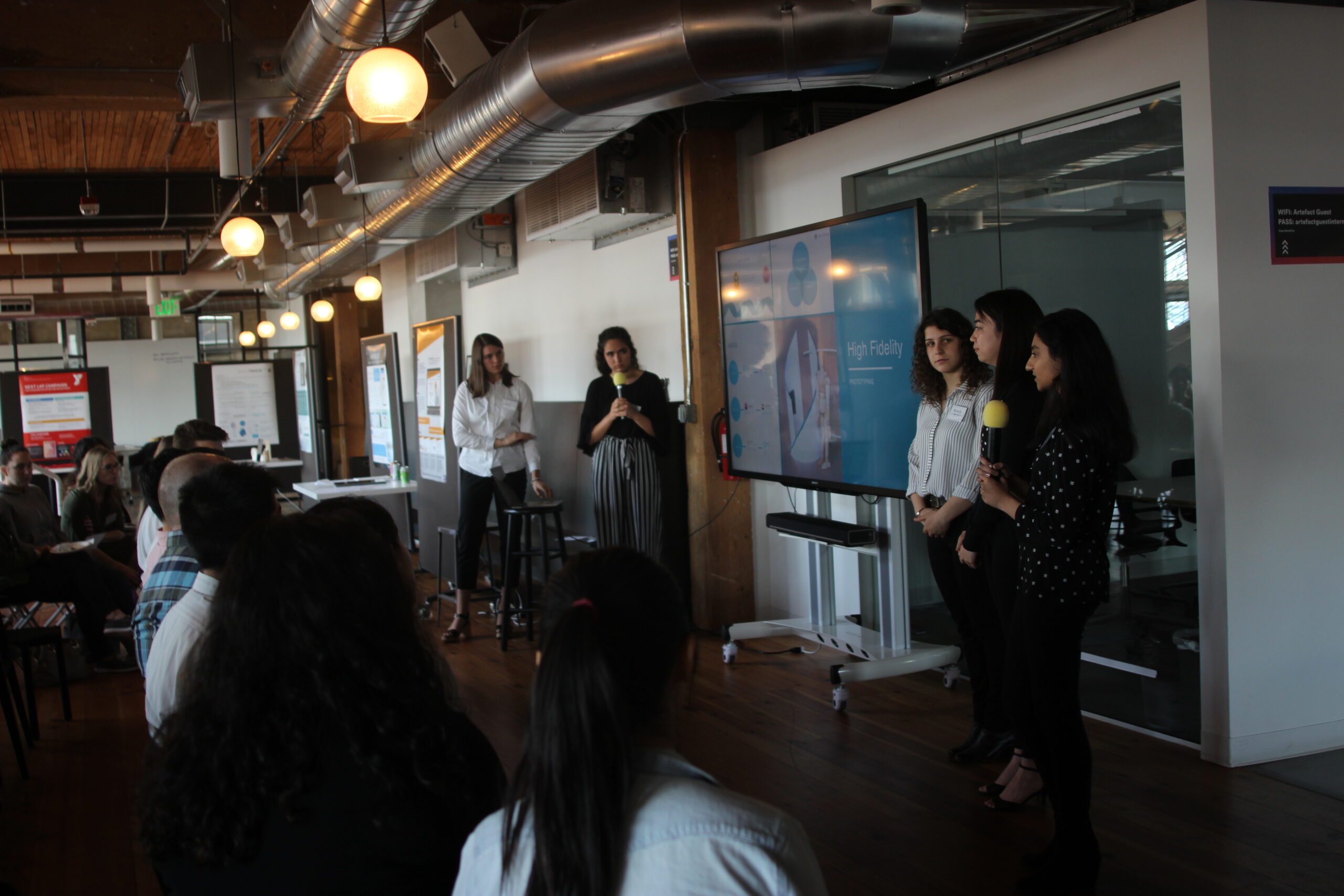
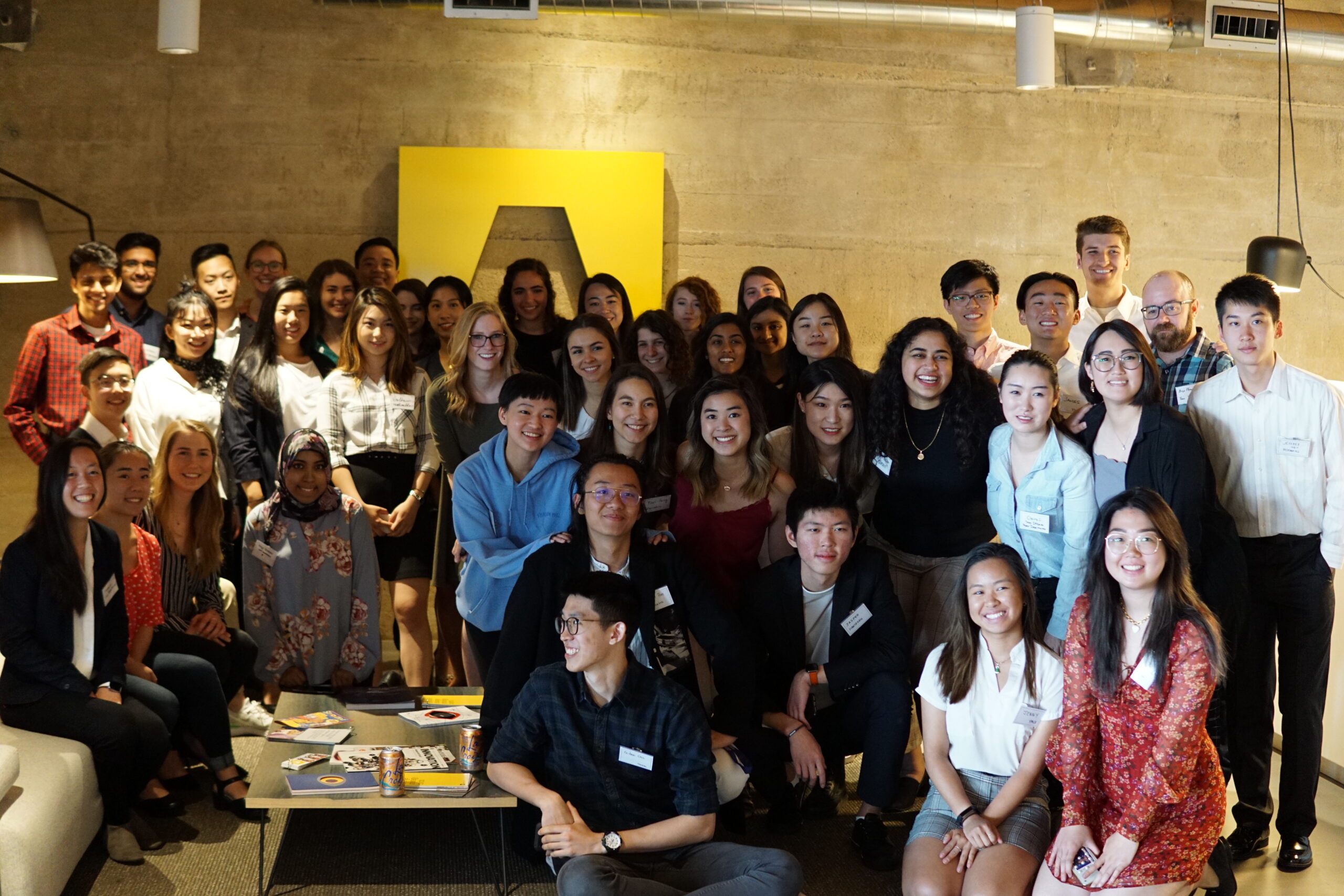
We were allotted some time to present our project to the community as a whole, followed by an hour or so of tabling - where we were able to have more detailed conversations about Aurora.
Check out our slide deck!
Takeaways
This being my first experience with the breadth of the design process, I came away from the project with an enormous amount of knowledge and excitement. I came to college with an unclear direction of where I wanted to go or what I wanted to do, and the work I did with DFA shined a light on the path of UX Design. I got to see just how interdisciplinary this field is and all the different spheres of knowledge I can pull from in order to design a solution.
Next Steps
We ended up putting a pause on Aurora and transitioning to presentation preparation before we got a chance to conduct some usability testing of our high-fidelity prototype.
In the future, I would like to go back and take advantage of the non-linear nature of the design process by getting some usability feedback and iterating on the existing work.
Selected Works
DIVVUPInteraction Design, Visual Design
CappuccinoVisual Design, Product Research
Patient AdvocacyService Design, UX Research

TecanUX Design, Information Architecture
AuroraUX Research, Service Design
Sock BoxIndustrial Design, Packaging Design
Interested?
I am always looking for new ways to get involved in my community and gain experience in industry - let's connect!