
OVERVIEW
Working under Design for America's TBD program, myself and four of my peers were tasked with creating a web experience for nonprofit Latinas Contra Cancer's new patient advocacy cohort: Defensoras.
The cohort aims to empower Latinas to take charge in the aspects related to their health as well as to collectively organize and become change agents primed to dismantle health inequities in Santa Clara County.
Our deliverables consisted of a high-fidelity mockup of the proposed Defensoras web experience, to be implemented through WordPress by the company.
ROLE & DURATION
User Research Synthesis
Wireframing
Usability Testing
High Fidelity Prototyping
October '20 - December '20
CONTRIBUTORS
Megan Tan, Jacob Hohn, Andrew Caballero, Kyu Eun
THE PROBLEM
How might we design a web experience to foster and build a community of patient advocates as patients and as Latinas?
Synthesizing Research
We inherited most of our primary research from YCore stakeholder interviews and documents outlining the mission of the advocacy cohort. This helped us understand our problem space a little more and gave insight into why and who we were designing for.
INITIAL INSIGHTS FROM STAKEHOLDER INTERVIEWS
01
Language and social barriers faced during treatment
02
Lack of low-cost accessible advocates in the community (in other words, lack of community support)
03
The need for resources and learning material - education for advocacy
Empathizing via Personas
From the information we gained in user insights, we went ahead and developed a couple of user personas to help us outline those who would be interested in the advocacy cohort - those who we would subsequently be designing for.
Ideation
Initial exploration into potential design solutions came from a few rapid and collaborative brainstorming sessions on Figma. We went through a few iterations of broad & narrow and eventually arrived at a user flow that outlined our plan.
AFFINITY MAP
Once we arrived at a list of potential pages and features, we created an affinity map. Categorizing and plotting our collective ideas on "important customer problem" against "solves the problem well," we were able to prioritize which pages/features we wanted to implement that will best serve our users and accomplish the goals of the cohort.
USER FLOW DIAGRAM
Our solution was centered around three main components:
01. Landing / About
02. Information / Resources
03. Community / Connect
A/B Usability Testing
Moving onto wireframing, we went forward with two versions of our mid-fi prototype. The landing page was straight forward, but we had a couple of different ideas when it came to the info and community pages. In order to determine what worked best, we turned to our stakeholders for feedback.
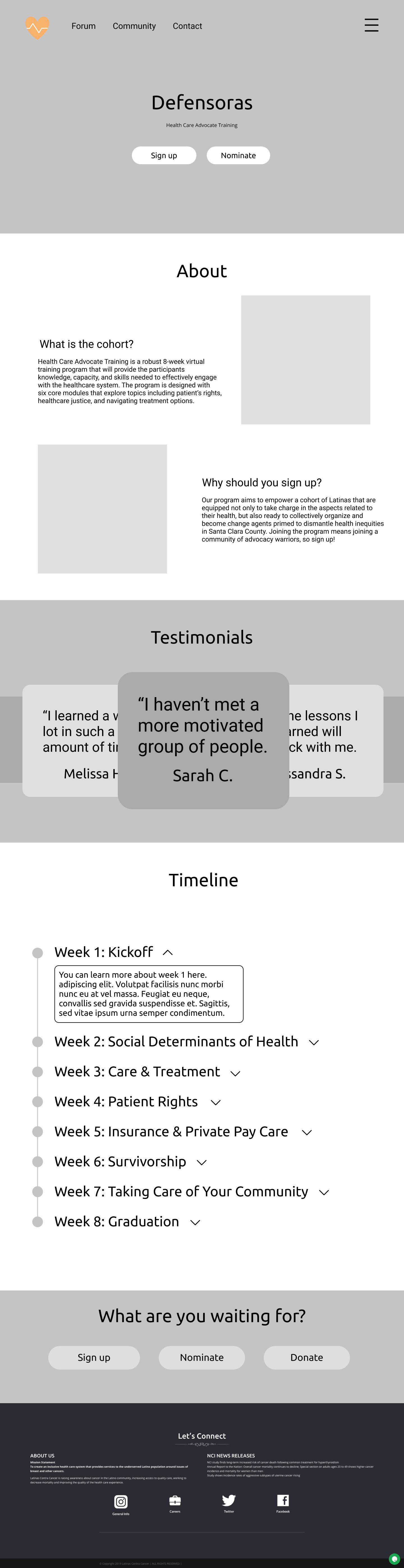
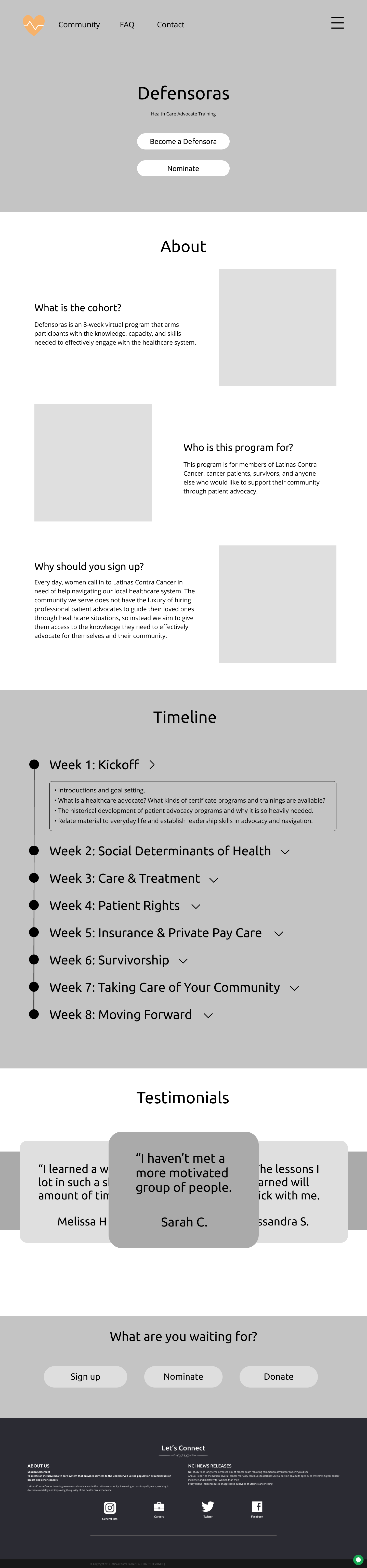
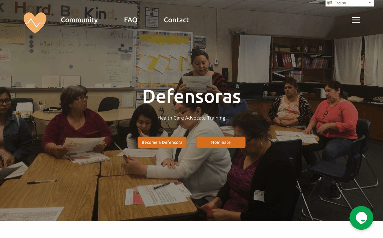
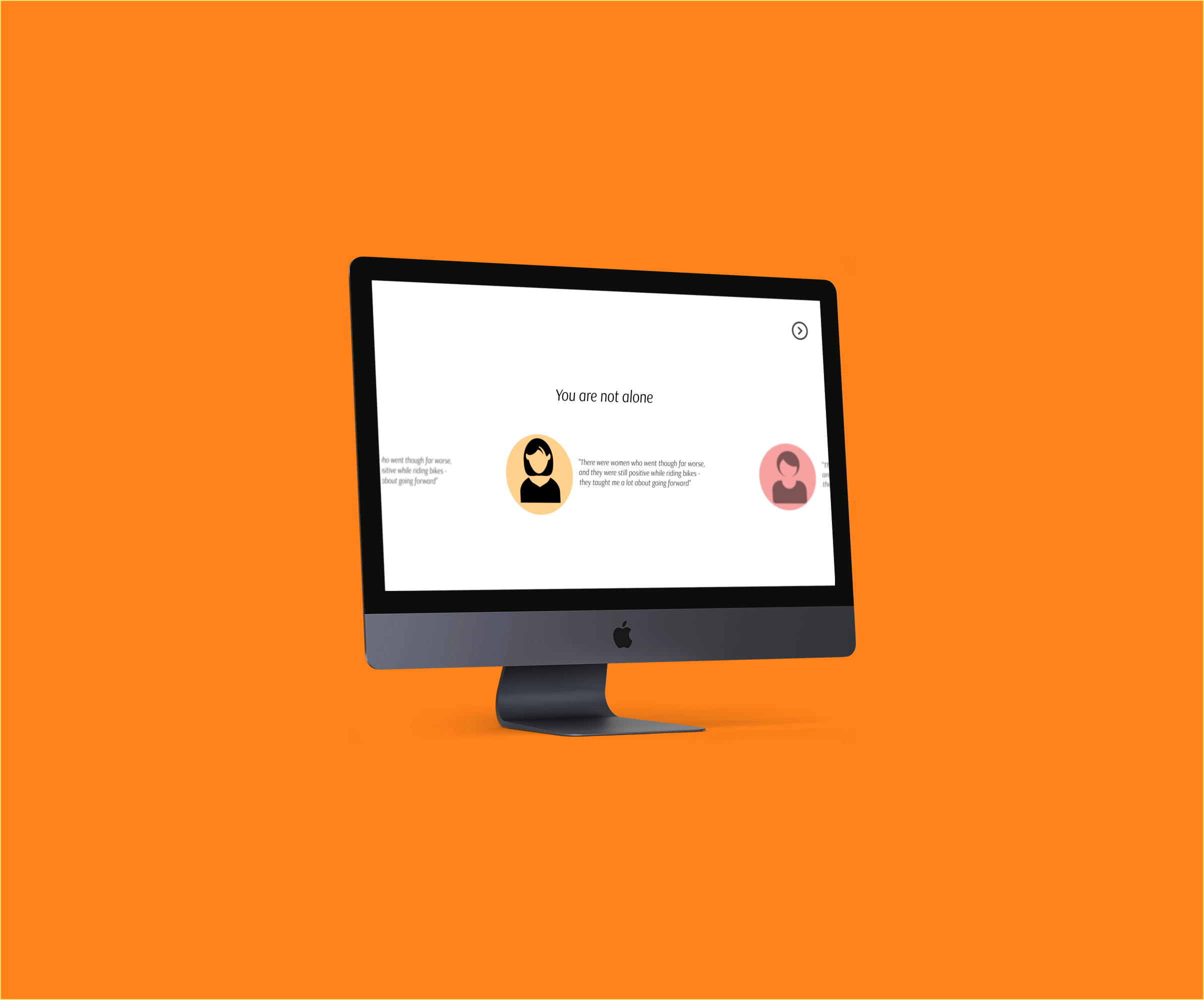
THE LANDING PAGE
Feedback from usability testing indicated the need for a bigger emphasis on the timeline section. It was also pointed out to us that not enough information about the cohort was actually presented. The iteration pictured shows these improvements.
"The primary purpose of why [the cohort] exists should be front and center."
[Before]
[After]
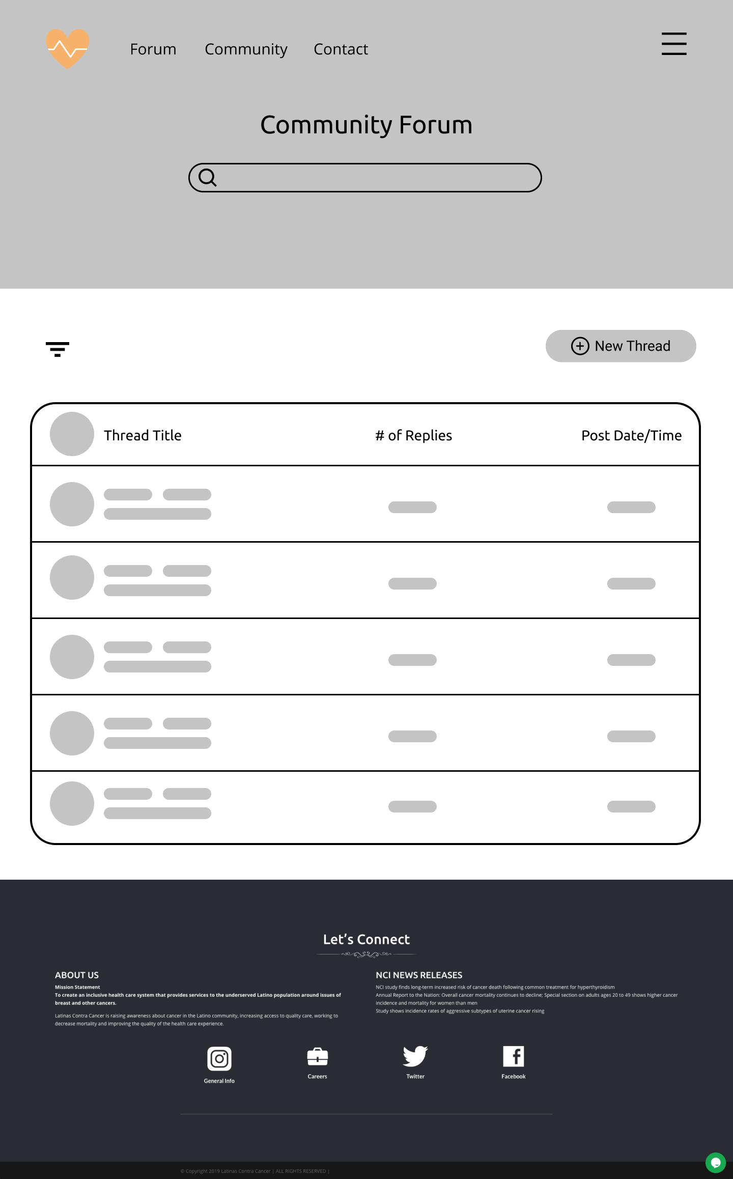
THE FORUM
We had originally figured an open public forum would garner the most community outreach and transparent communication; however, user feedback helped us realize the privacy implications, as well as the complexity - prospective cohort members preferred simplicity over control.
[Before]
[After]
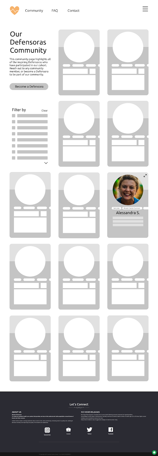
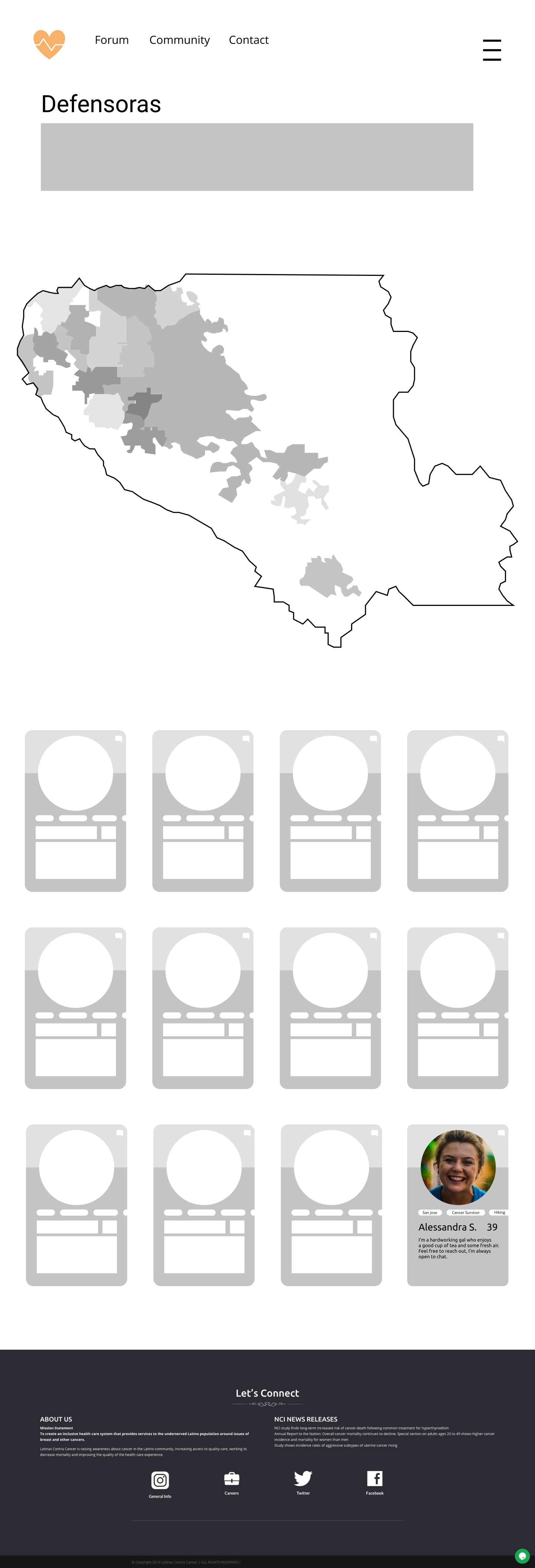
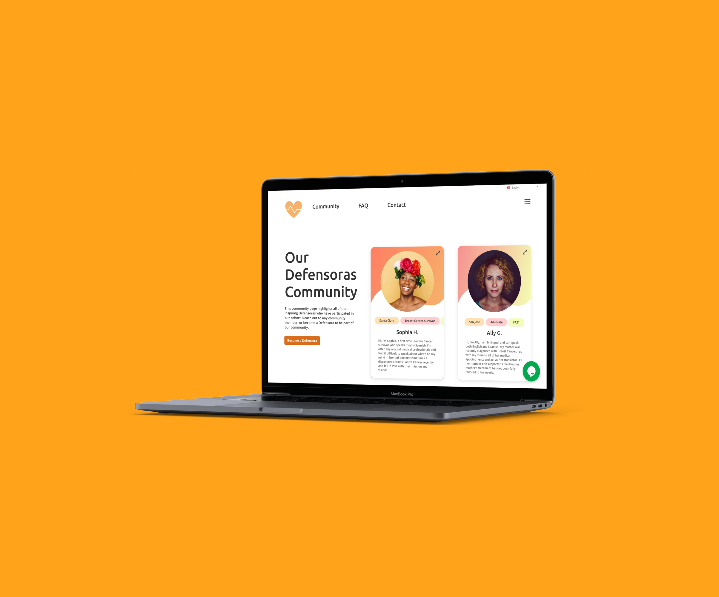
THE COMMUNITY PAGE
Our main framework for the page was inspired by the Blacks/Women Who Design community pages. We went ahead with A/B testing to find out how each community page resonated with our users. Each of our interviewees had a different opinion on the two pages, with one in favor of the map, one opposed, and one impartial.
We ended up closely aligning with one of the interviewee's reasoning behind moving forward without the map, claiming that the map doesn’t add anything more to the page than what can be achieved with the filters and tags.
[No Map - Winner]
[Map - Loser]
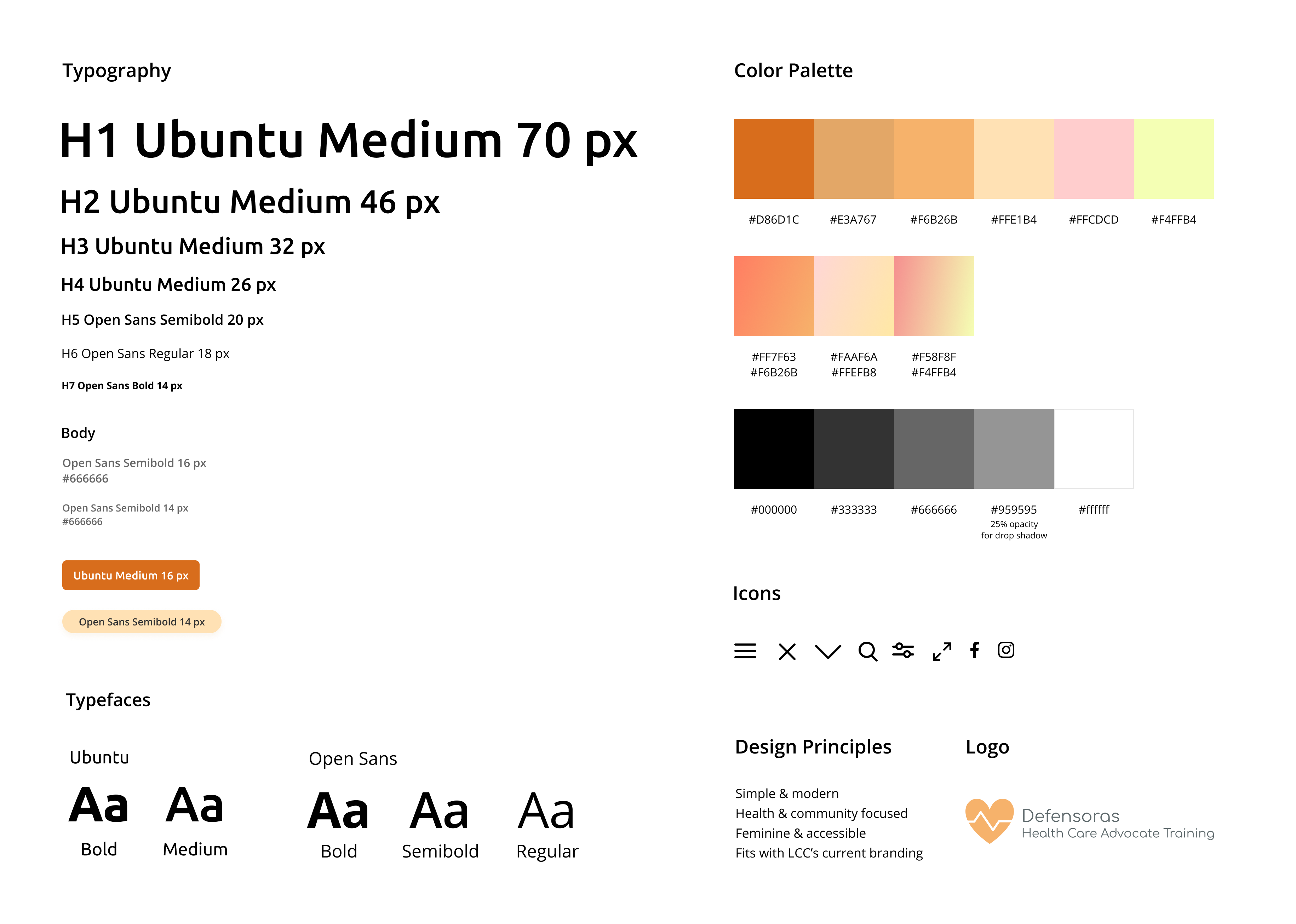
Design System
We elected to keep the style and typography used in our hi-fi prototype similar to the LCC site for consistency. Original shades of orange were, again, kept for consistency, as well as pink and green to act as accents since they match the “feminine” look that LCC was looking for; we also expanded the color palette to include gradients with these colors.
Other components were incorporated under LCC’s design principles for the cohort: simple/modern • health/community-focused • feminine/accessible
STYLE GUIDE
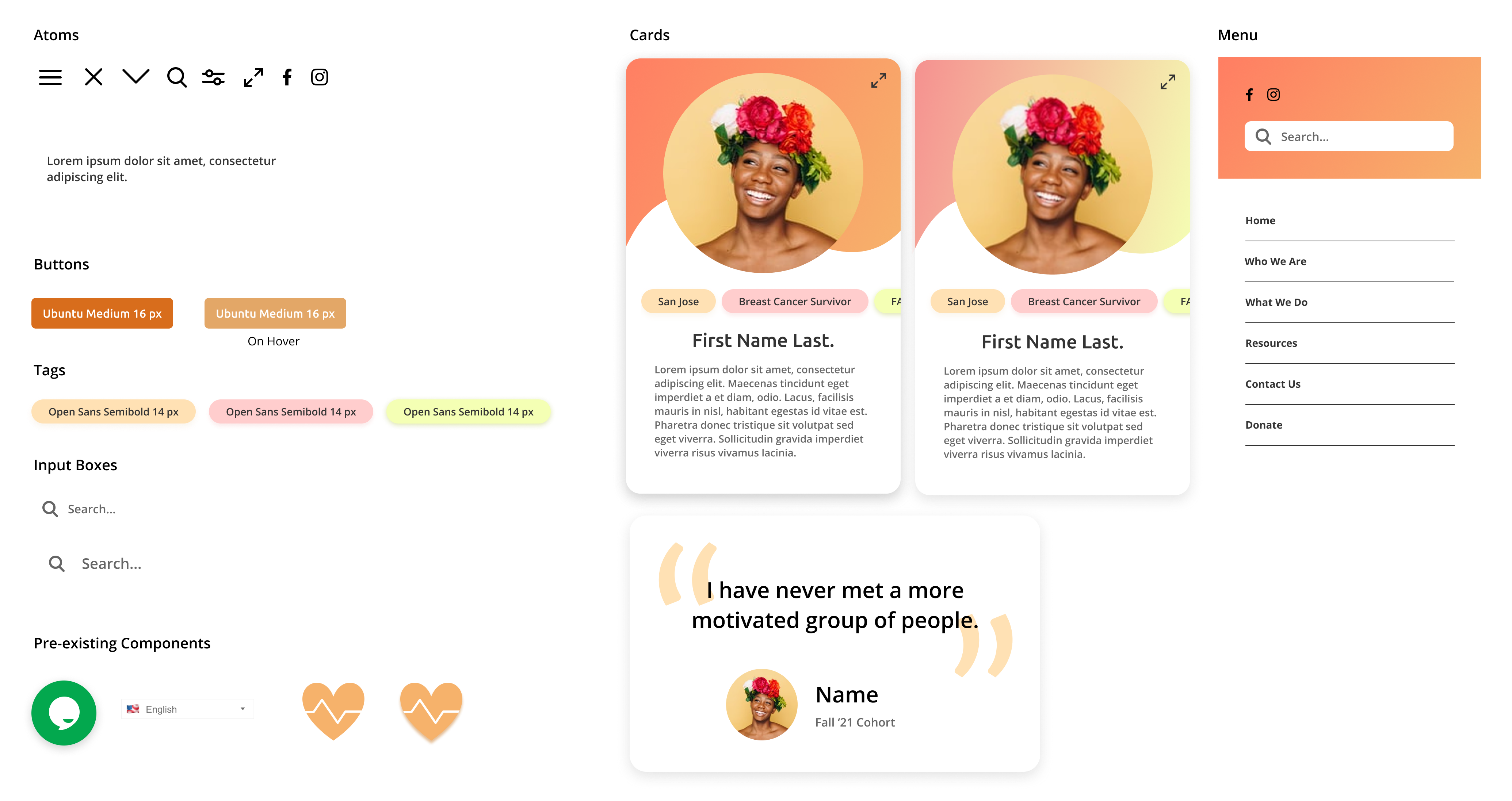
COMPONENT SYSTEM
High Fidelity
THE LANDING PAGE
• Found pictures of previous LCC activities online that evoked a sense of community and education.
• Updated the copywriting to contain less warrior language and complex words to be more specific and accessible for a broader audience.
• Changed testimonial format from carousel to an all in one display for easy viewing (less clicking).


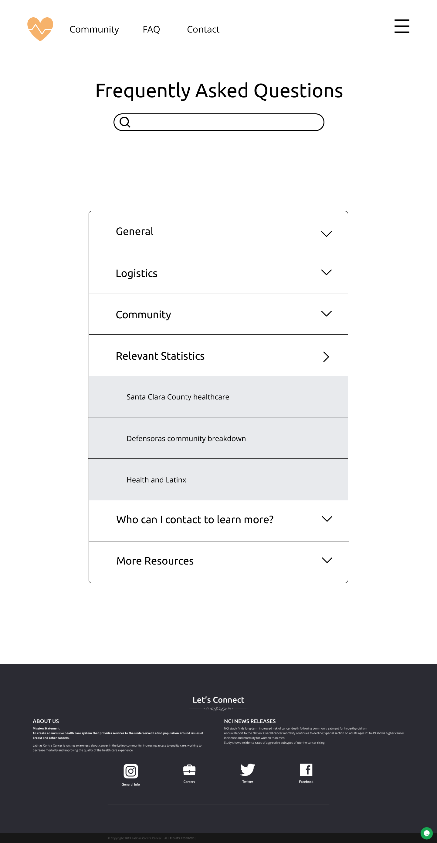
FAQ
• Included a "Top Questions" section for site visitors who don't know what they're looking for.
• Categorized FAQs for easy searching.
• Minimized clutter with a drop-down feature that reveals topic-specific questions upon clicking.
COMMUNITY
• Showcased vast Defensoras community through bios, tags, and filters.
• Facilitated accessible communication between current and prospective members through the chat feature (while keeping privacy).
• Utilized colorful gradients and rounded components to give the front-facing view of the page a welcoming and inviting feeling.
Takeaways
This was a great opportunity to continue my involvement with Design for America! The length of the project showed me that sometimes there is a need to sacrifice time spent on one aspect of the design process to pay attention to another aspect. This sort of time management is key to pumping out a successful prototype that meets the deliverable requirements and is something to be proud of.
Special thanks to Intuit mentors Malcolm Jackson and Junior Rivera who helped us through the quarter!
Selected Works
DIVVUPInteraction Design, Visual Design
CappuccinoVisual Design, Product Research
Patient AdvocacyService Design, UX Research
TecanUX Design, Information Architecture
AuroraUX Research, Service Design
Sock BoxIndustrial Design, Packaging Design
Interested?
I am always looking for new ways to get involved in my community and gain experience in industry - let's connect!